
It looked perfect on your laptop, and on a phone the text runs off the edge. There are three ways to check, and the easy ones are the least accurate. Use them in order.
1. Device mode in dev tools (quick)
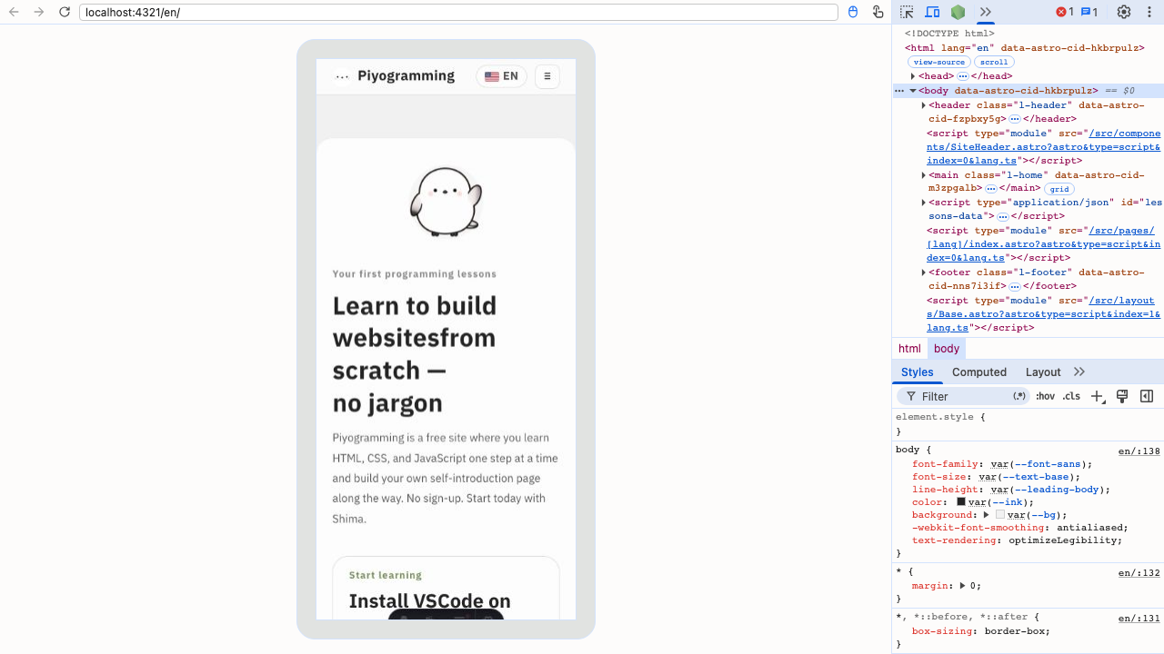
The fastest option. Open your browser’s dev tools and switch on the device toolbar.
| OS | Open dev tools | Toggle device mode |
|---|---|---|
| Windows | F12 or Ctrl + Shift + I | Ctrl + Shift + M |
| Mac | ⌘ + Option + I | ⌘ + Shift + M |
Pick a device (iPhone, Pixel, …) at the top and the page renders at that width. For hunting layout breakage while changing widths, this is plenty.
2. Open your dev server from a real phone (recommended)
Reach the server running on your computer directly from your phone. You see the page you’re building on a real device, which makes this the most practical option.
Step 1: find your computer’s local IP address
ipconfig getifaddr en0 # Macipconfig # Windows (look for the IPv4 address)You get something like 192.168.1.5. That’s your computer’s address within the Wi-Fi.
Step 2: start the server so it accepts outside connections
VS Code’s Live Server works as-is. Other dev servers need a flag to allow external access.
npx astro dev --host        # Astro
npm run dev -- --host       # Vite
The Network: line printed at startup gives you the address to use.
Step 3: open it in your phone’s browser
http://192.168.1.5:5500 ← the address you found + the portType it into your phone and the page you’re building appears on a real device. Save a file and the phone updates too.
3. Publish and open the URL (certain)
Once published, you can check any device under real conditions, and sending someone a link is all it takes.
Git & GitHubPublishing with GitHub PagesPublishing a repository you’ve put on GitHubTipsHow to publish your site on the internetPublishing by drag and drop (Netlify and friends)What only a real device reveals
The classics that pass in device mode and break on a phone.
hover doesn’t exist
A finger has no “resting on it” state. Information that only appears on hover is information a phone user never sees. Don’t hide anything important behind it.
Screen height (100vh) shifts
Mobile browsers grow and shrink their address bar, so height: 100vh can overflow the screen. Use 100dvh, or build without fixing heights.
Tapping an input zooms the page
Safari on iOS zooms when you tap an input with a font size under 16px.
input,
textarea,
select {
  font-size: 16px;   /* 16px or more: no zoom */
}
Things are hard to tap
A target for a fingertip wants to be at least 44px square (the number from Apple’s guidelines). Links and buttons smaller than that catch their neighbours instead.
.btn {
  min-height: 44px;
  padding: 12px 20px;
}
A horizontal scrollbar appears
One overflowing element makes the whole page slide sideways. The usual culprits are image widths and fixed widths.
img {
  max-width: 100%;
  height: auto;
}
A pre-publish phone checklist
- No horizontal scrolling
- Text isn’t too small (body around 16px)
- Buttons and links are big enough to tap (44px+)
- Tapping an input doesn’t zoom
- Nothing important is hover-only
- Images aren’t heavy (bearable on mobile data)
-
<meta name="viewport">is present
Summary
- Device mode is quick but only reproduces width; iOS quirks stay hidden
- Reaching your dev server from a real phone is the most practical (
--hostplus your local IP) - The real-device differences are hover, 100vh, input zoom, tap targets, and horizontal scroll
People will see your work on a phone more often than not. Keeping a real device beside you while building cuts the fixing in half.