
Tips・Level up your design

Color-scheme sites so you never agonize over color

"I'm bad at deciding colors..." is something tools can solve. Pick from ready-made sets, just browse, build from a lead color, check it on real designs, gradients—here's a full roundup of color sites by type, with screenshots.

When you build a page, choosing colors is surprisingly often where you get stuck. “This doesn’t quite match…” and you redo it—but this isn’t a matter of taste; it’s something tools can solve. Pros decide colors with tools too. There are tons of color-scheme sites out there, so here we round them up by what you want to do, with screenshots. You don’t have to try them all. Bookmark the ones that click for you.

TipsColor code list and color swatch bookFor how to read color codes and a swatch book you can use as-is, see here

Type 1: Pick from ready-made sets (simple palettes)

“Building from scratch is a pain. I just want to quickly pick something good”—most recommended for people like this. Color combinations made by pros are lined up for you to browse. Just look through them, click the one you like, and copy.

Color Hunt

The most popular classic, where you can narrow down by category.
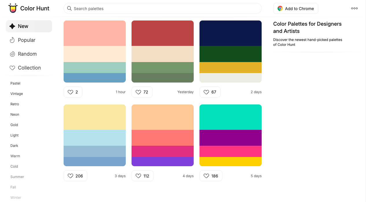
The Color Hunt screen. Categories like Pastel, Vintage, and Retro on the left, and color palettes grouped in sets of 4 colors on the right
Narrow to your mood with Pastel (gentle colors) or Dark (dark colors) on the left. Start here for “one set to your liking.”

Color Hunt

ColorDrop

Find 4-color palettes by search or filtering.
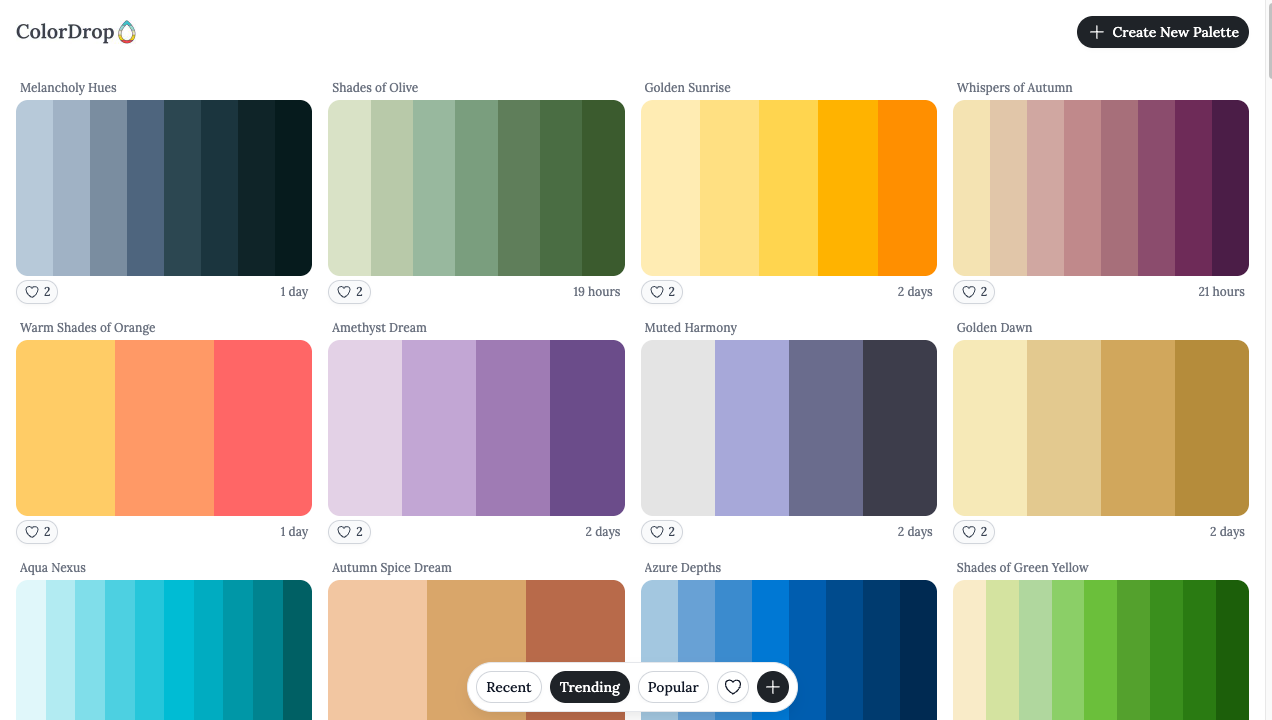
The ColorDrop screen. Many named 4-color palettes lined up in tiles
Each palette has 4 colors. They’re named too, so they’re easy to pick.

ColorDrop

SchemeColor

A huge number of named color schemes. Searchable by theme.

The SchemeColor top page. A “Beautiful Color Schemes & Palettes for Designers” heading and theme tabs like Pastel, Wedding, and Summer
Search from thousands of schemes by theme, like “Wedding” or “Summer.”

SchemeColor

LOLcolors

A lineup of cute-toned palettes.
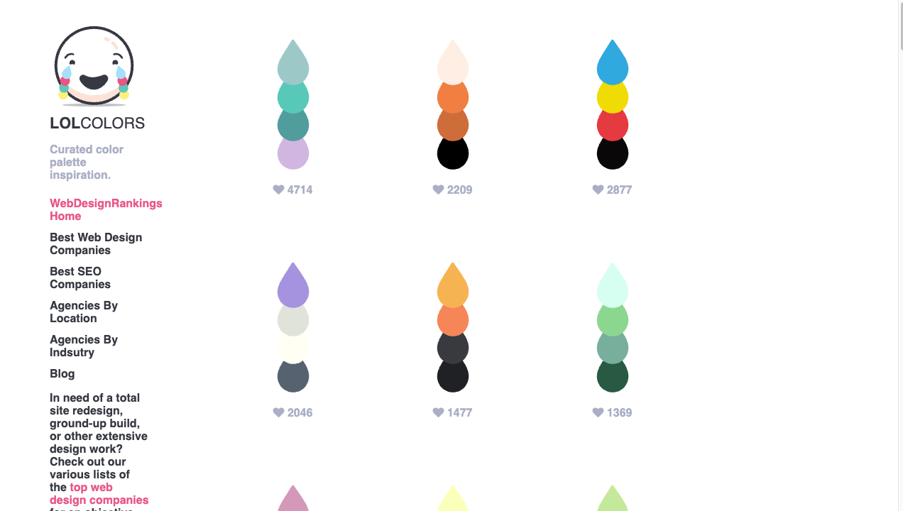
The LOLcolors screen. Palettes stacking 4 colors in a teardrop shape, with a laughing-crying face logo
A cute teardrop look. For people who like soft colors.

LOLcolors

Type 2: Browse with zero ideas

When “I have no idea at all what colors would be good,” sites that give you a spark just by browsing are a big help.

NIPPON COLORS

Traditional Japanese colors. Pick one and the whole page is dyed that color.
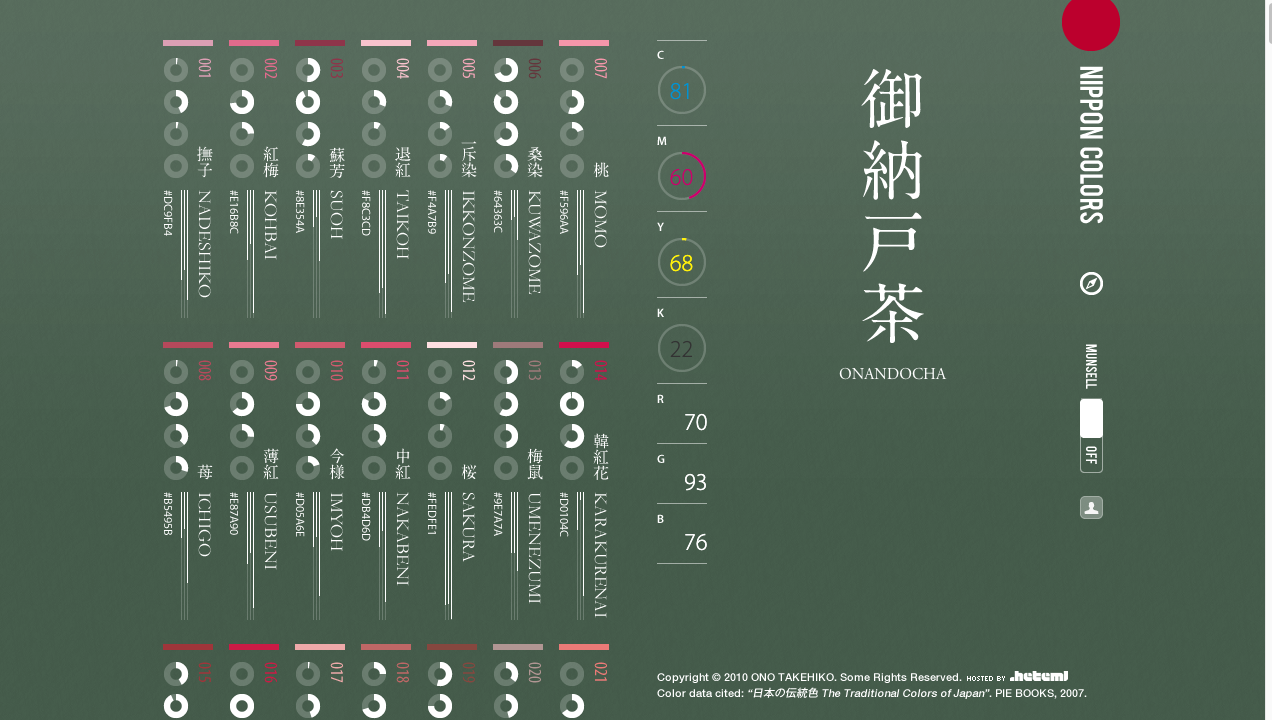
The NIPPON COLORS screen. Names of traditional Japanese colors lined up, with the chosen “Onando-cha” dyeing the whole page a calm green
“Sakura,” “Suou,” “Imayo”—Japanese colors with beautiful names too. Just browsing, you’ll find a color you want to use.

NIPPON COLORS

HELLO COLOR

Each click gives an easy-to-read 2-color combination.
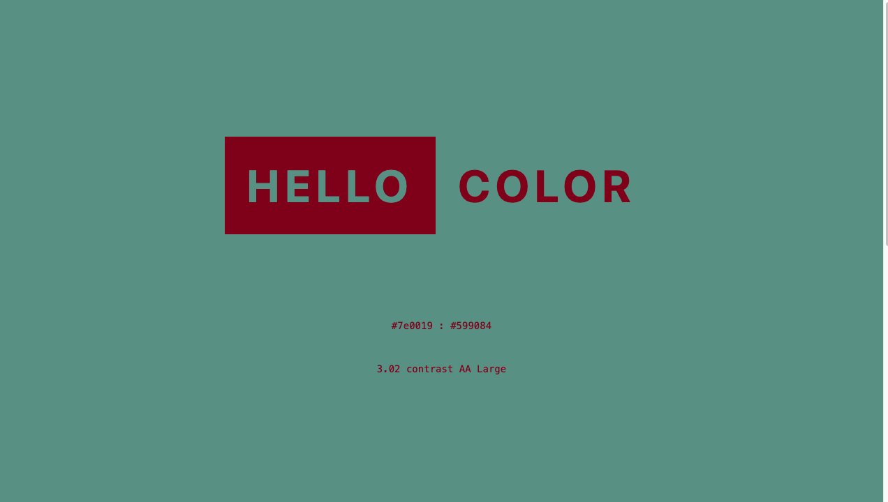
The HELLO COLOR screen. “HELLO COLOR” shown in deep red text on a green background, with the 2 color codes and a contrast value
Just 2 colors, for background and text. The simplicity feels good.

HELLO COLOR

random material palette

Suggests pretty colors at random.
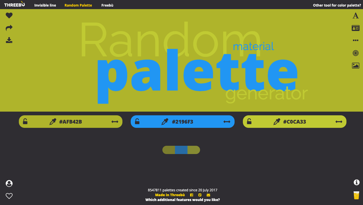
The random material palette screen. 3 generated colors lined up side by side, each with a color code shown
Each press of “START” pops out a set of cohesive colors.

random material palette

Colordot

An intuitive tool where colors are decided just by moving the mouse.

The Colordot screen. A vivid light blue fills the whole screen, with a color code and “Click to Save” in the center
Move the mouse left and right to change the color, up and down for brightness. Click to collect colors.

Colordot

Type 3: Build from a lead color

“I’ve already decided on one color I want to use. I want it to give me colors that match”—this is for that. Decide the lead, and it suggests the surrounding colors.

Coolors

Generate 5 colors one after another with the spacebar. The classic of classics.
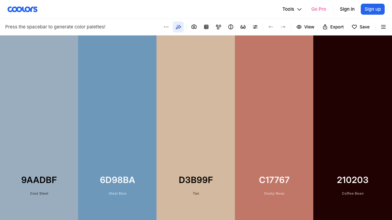
The Coolors screen. 5 colors lined up vertically, each with a color code and color name below. “Press the spacebar to generate color palettes!” at the top
You can also lock a color you like with the padlock icon and change only the ones around it. Copy the color codes with a click.

Coolors

ColorSpace

Enter one color and it builds matching palettes and gradients.
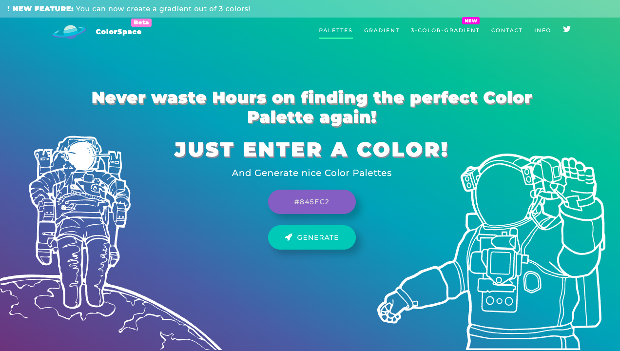
The ColorSpace screen. An astronaut illustration, a “JUST ENTER A COLOR!” heading, a field to enter a color, and a GENERATE button
Just enter one color you like and press GENERATE. You can make gradients too.

ColorSpace

Colormind

An AI suggests natural, “human-like” color schemes. You can lock colors and adjust.
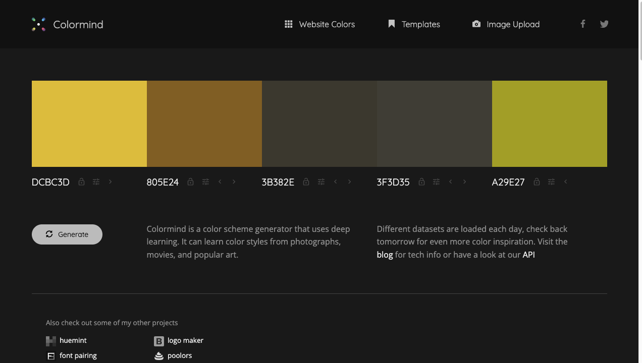
The Colormind screen. A 5-color palette, a Generate button, and an explanation about making color schemes with AI
An AI that learned from photos and famous paintings puts out natural combinations.

Colormind

khroma

Pick a few colors you like, and the AI learns your taste and makes suggestions.
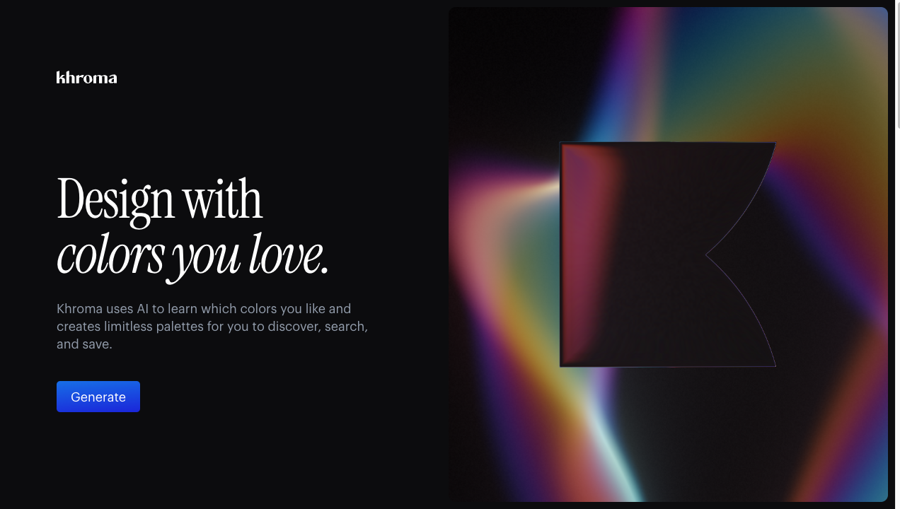
The khroma screen. A “Design with colors you love.” heading, an explanation that the AI learns your taste, a Generate button, and colorful logo art
The more you use it, the more it becomes “your taste.” You just have to go through a short round of picking colors you like at the start.

khroma

Pigment

Shows you lots of color pairs.
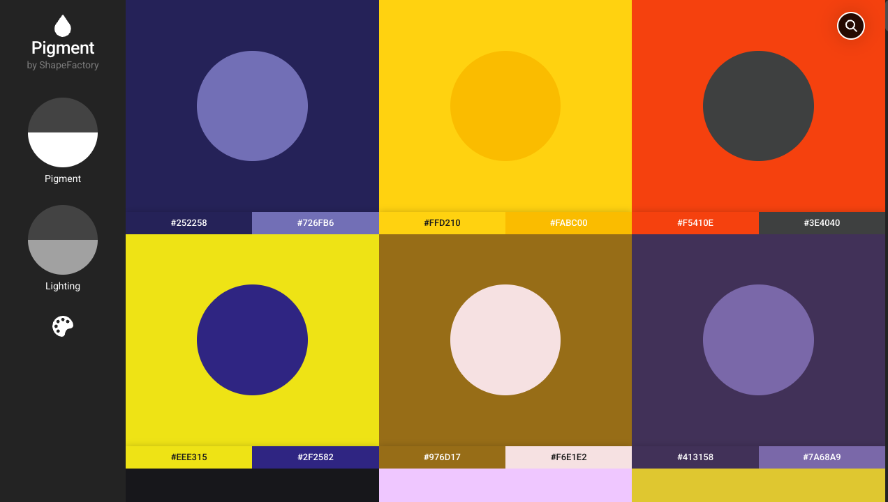
The Pigment screen. Squares of color schemes with circles on top of colors laid out in a grid, each with a color code
Pairs of “a background + a color on top of it” in a list. Good reference for combinations.

Pigment

Huemint

An AI generates color schemes suited to a purpose, for sites and logos.
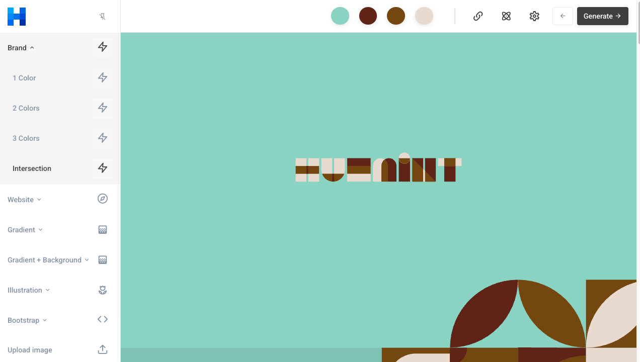
The Huemint screen. A menu like Brand, Website, and Gradient on the left, and brand-like graphics with that scheme applied on the right
Choose a use, like “brand” or “site,” and it puts out a fitting color scheme.

Huemint

Type 4: Simulate with a real look

Even if a color is good on its own, it can be “meh once placed on a page.” This type lets you check it applied to a real design.

Happy Hues

Applies color schemes to real pages and even shows you where to use each.
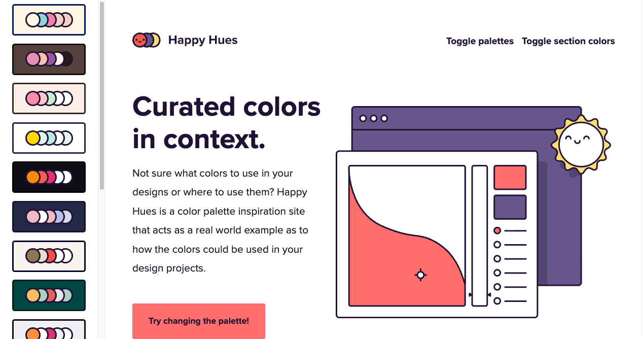
The Happy Hues screen. A list of selectable palettes on the left, and a “Curated colors in context.” heading with illustrations on the right, with that scheme used on a real web page
Click a palette on the left and the whole page’s colors switch on the spot. A site beginners will love, letting you picture “where to use” each color.

Happy Hues

palettemaker

Compare the color scheme you made by applying it to real UI and art.
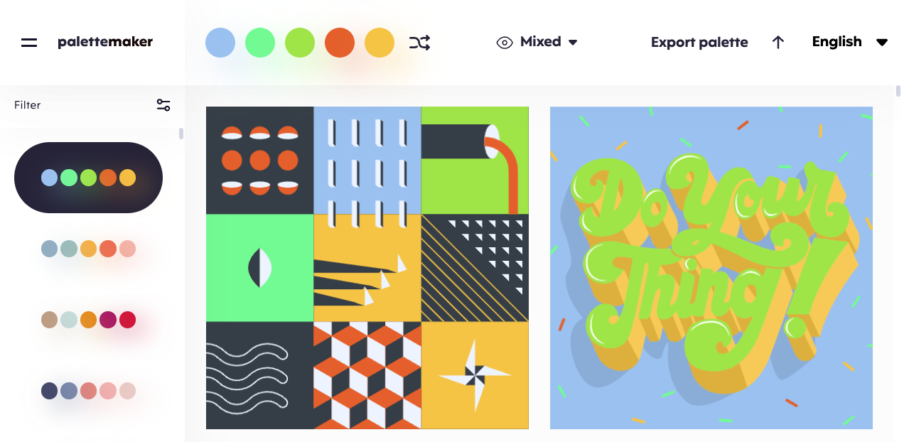
The palettemaker screen. Color-scheme variations on the left, and colorful design samples with the scheme applied in the center
See how the same scheme looks in real designs. You can choose based on how the finished result will look.

palettemaker

Colorable

Judges whether your background and text colors are easy to read.
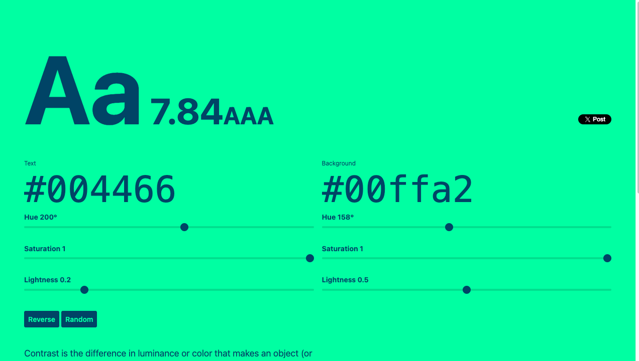
The Colorable screen. A large “Aa 7.84 AAA” display, color codes for the text and background colors, and sliders to adjust the colors
Check readability with a number (contrast ratio) and a rating like “AAA.” An important tool for keeping text from becoming hard to read.

Colorable

Type 5: Find gradients

Not just single colors—gradients that change smoothly from color to color can make backgrounds and buttons much more stylish, too.

Grabient

Choose a beautiful gradient and copy the CSS.
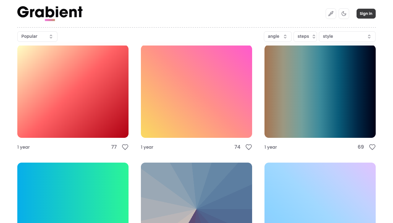
The Grabient screen. Tiles of vivid gradients lined up, with settings at the top to change the angle and number of steps
Adjust the angle and colors, and you immediately get CSS you can paste into background. ColorSpace from Type 3 can make gradients too.

Grabient

Color impressions: warm and cool

When a color site keeps giving you similar colors, keeping in mind whether it’s warm or cool makes choosing easier.

  • Warm colors (red, orange, yellow)—a cheerful, friendly, appetite-inducing impression. Good for buttons and sale appeals
  • Cool colors (blue, light blue, teal)—a calm, trustworthy, clean impression. Good for corporate sites and medical or financial fields
  • Neutral colors (green, purple)—an in-between that leans neither way. Easy to match with both warm and cool

When something “just doesn’t quite match,” simply checking whether you’ve mixed warm and cool colors without committing to either often improves the cohesion.

Picking up colors (the eyedropper)

When you think “that color on that site is nice,” you can also pick up the color.

  • VSCode … Hover over where you write a color in CSS and a small color square appears; click it to open a color picker.
  • Browser extensions … With Chrome’s ColorZilla and the like, you can pick up a color anywhere on the screen with the eyedropper.

When in doubt, the “3-color rule”

The more colors you use, the harder cohesion gets. Until you’re used to it, we recommend this ratio.

RoleRough proportionExample
Base (wide areas like the background)70%White, light gray
Main (the lead color)25%One color you like
Accent (spots to stand out)5%Buttons and links

Just narrowing the number of colors already gets you closer to a polished look.

AccessibilityReadable colors, unreadable colors (contrast)For how much difference makes things readable and what the standard is, see hereTipsWeb design reference sitesFor how to actually use the colors you chose on a real page, with layout examples, see here

Summary

  1. Choose color sites by what you want to do—pick / browse / build / check / gradients
  2. When in doubt, start by picking with Color Hunt or browsing NIPPON COLORS
  3. Narrowing the number of colors with the “3-color rule” gives a cohesive look

Once your tools are lined up, the rest is just learning as you build.

FAQ

Is it OK, copyright-wise, to use the colors from a color site as-is?
Colors themselves and numeric combinations of them are generally held not to be subject to copyright, so referring to them and using them as-is is no problem. Do avoid copying a page's entire layout or design wholesale.
Should I just learn one color site?
Yes—there's no need to force yourself to use them all. If you first learn one "pick" type like Color Hunt, it'll cover most situations. Knowing the other types just as side trips for when you're stuck is plenty.