
When something feels “somehow lacking,” looking at real examples is the fastest shortcut. Here I introduce web design reference sites sorted by what you want to do, with screenshots.
TipsColor-scheme sites so you never agonize over colorStuck on the colors themselves? Here.Type 1: Reliable all-around design galleries
These are standard sites that gather a wide range of real examples across every genre.
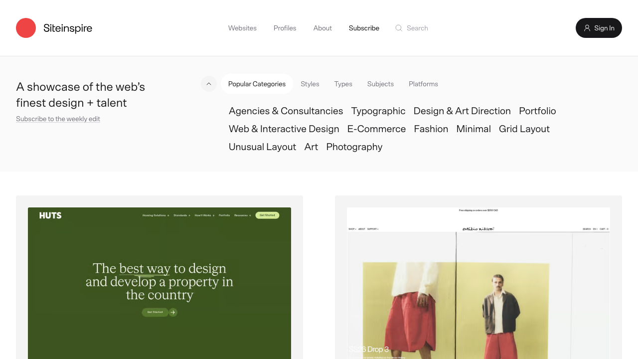
SiteInspire
A calm, high-quality gallery that’s been running for years. You can narrow things down by style, subject, type, and platform, so it’s easy to land on examples close to what you’re making.
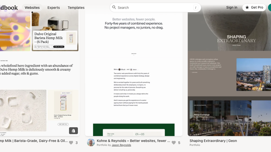
Land-book
A gallery collecting only carefully selected, simple and beautiful sites.
Type 2: Galleries focused on one-page sites
These sites collect only single-page sites, often called landing pages or “one pagers.” They’re a good fit when you’re thinking about a one-sheet layout, like a self-introduction page.
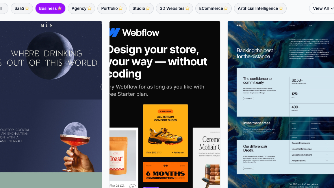
Lapa Ninja
A simple, easy-to-read gallery collecting only landing pages.
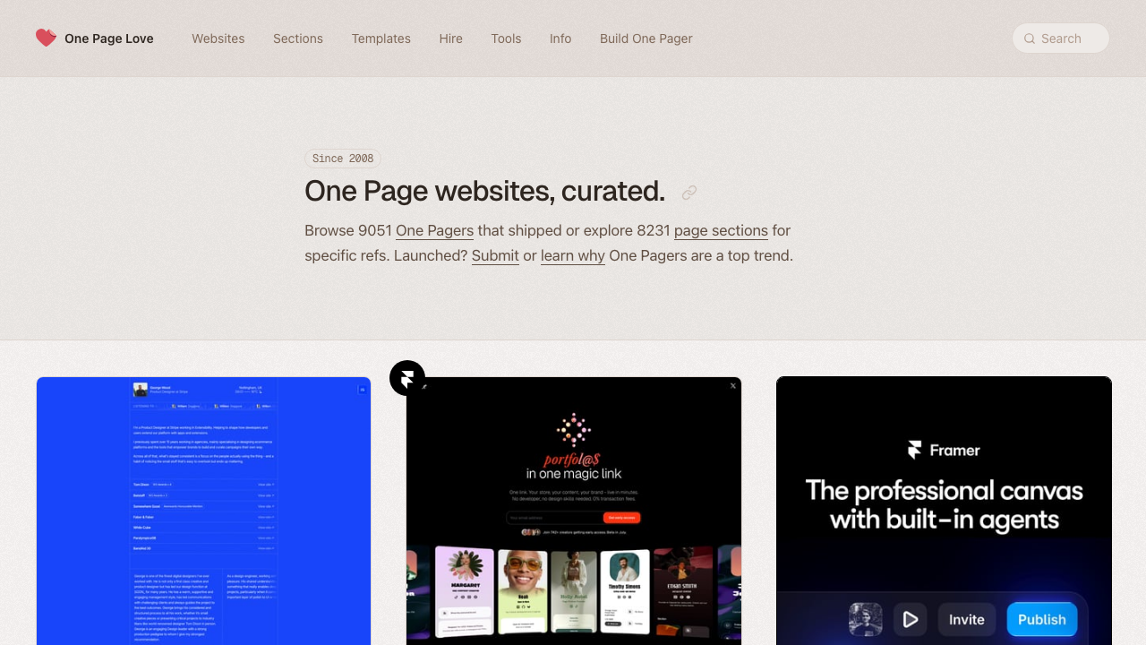
One Page Love
A gallery that has specialized in one-page sites since 2008, with thousands of entries. It’s the best fit for personal sites and portfolios, which are usually one page to begin with.
Type 3: Finding real examples of UI parts and screens
When you want to find real examples of small parts rather than the whole page (“How do I present a button?” “How should I arrange a form?”), sites like these are useful.
Mobbin
A huge UI database collecting over 600,000 screens from real apps and sites.
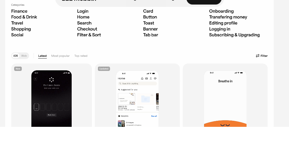
Even the free plan lets you view recently added entries, but a paid plan is needed to search thoroughly. Just knowing “this kind of resource exists” is plenty for now.
Dribbble
A standard site where designers post ideas for small parts like buttons and icons.
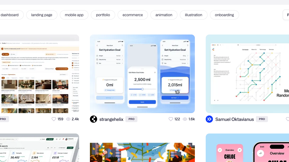
But unlike Mobbin, these are “works,” not apps that actually run. Some of them can’t actually be built as-is, so treat it strictly as a place for hunting ideas.
Type 4: Viewing award-level, top-tier design
When you want to see more refined, next-level design, these are the places that only let the very best through.
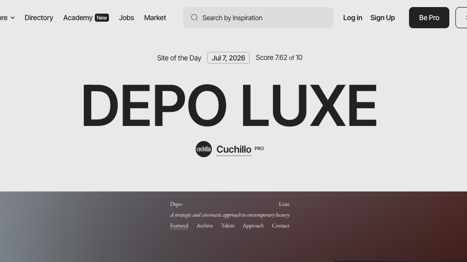
Awwwards
A site collecting award-level sites posted by designers around the world.
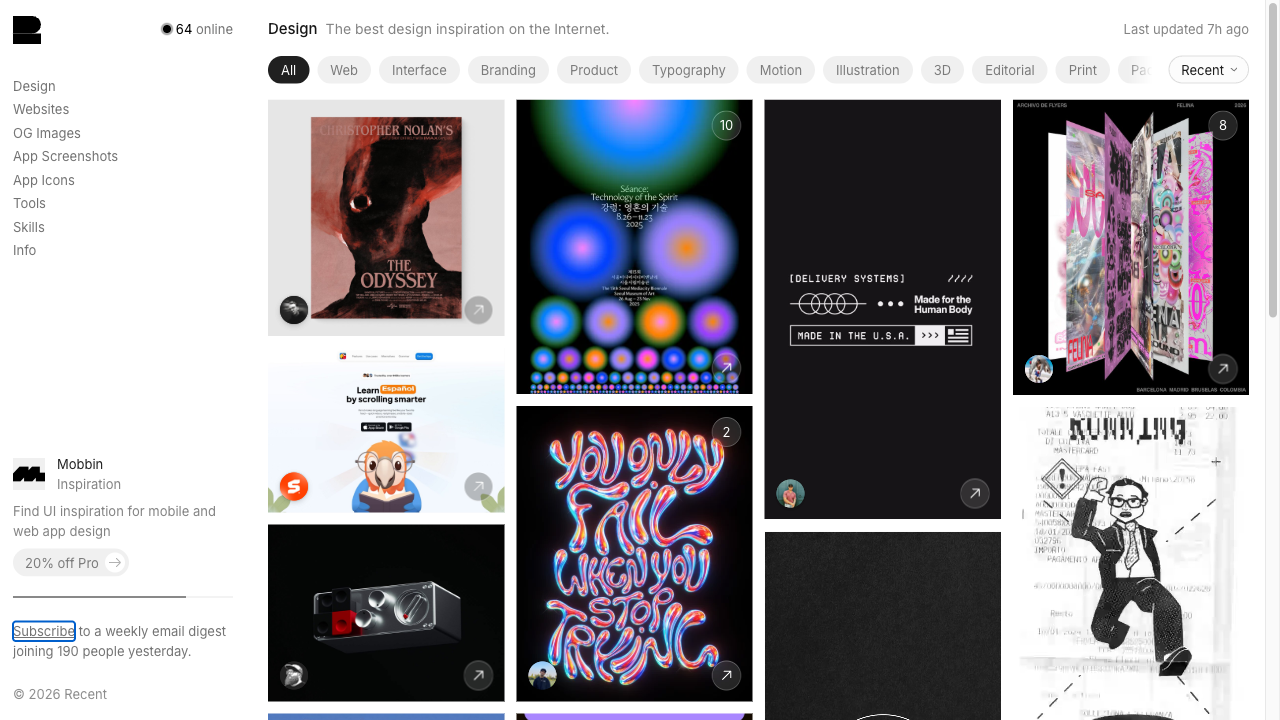
Recent (formerly Godly)
A gallery that collects only world-class work, and very little of it. It was long known as Godly; the same team now runs it as Recent, and it covers branding, typography, motion, and 3D as well as websites.
How to use reference sites: don’t imitate, break them down and learn
When you find a site you like, don’t try to reproduce the whole thing. Break it into elements and take them in.
| Part to reference | What to do |
|---|---|
| Colors | Borrow only the combination of colors used |
| Layout | See in what order the headings, images, and text are arranged |
| Use of whitespace | See how much space is left between elements |
Copying the code (HTML/CSS), photos, or text as-is is a no-go. Borrowing only the idea and writing the code with your own hands is the shortcut to getting better.
TipsGetting started with developer toolsHere’s how to use DevTools at a basic level.Summary
- Choose reference sites by what you want to do: all-around / one-page-focused / hunting UI parts / award-level
- Stuck on the whole page? SiteInspire or Lapa Ninja. Stuck on small parts like buttons? Start with Mobbin (paid for serious use) or Dribbble
- Imitate only the idea of colors and layout; write the code yourself
Just finding one page you like keeps your hands from freezing up when you build your own page.