
Google Fonts is handy because you can use many fonts (letter shapes) for free, but with so many kinds, the first wall is not knowing which to pick. So in this article, we’ve gathered beginner-friendly recommendations by type, each with a real text sample. You don’t need to use them all. As you browse, bookmark one or two that make you think “I like this.”
TipsChange the face of your text with Google FontsNot sure how to install a font in the first place? Start here. It covers the steps from loading to specifying oneType 1: Round and gentle (rounded gothic)
Rounded gothic, with its rounded corners, gives a soft, friendly impression. Perfect for pages aimed at kids or when you want a warm mood. It’s the most popular type among Japanese fonts, too.
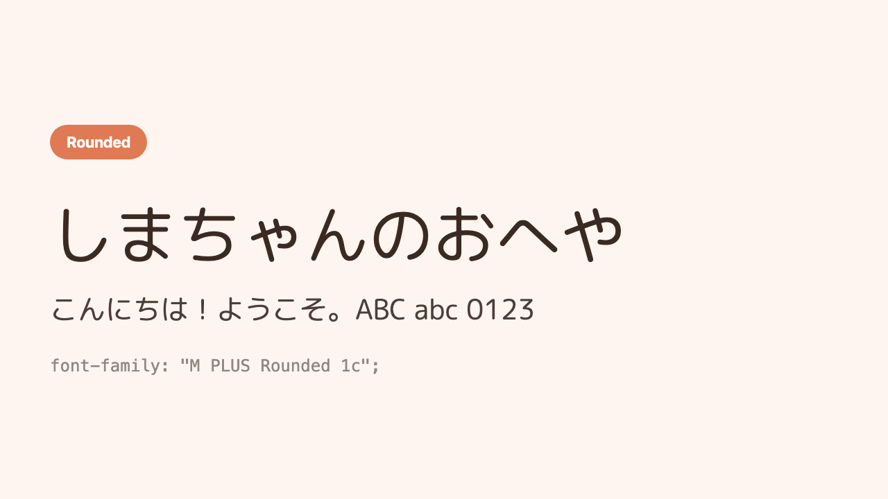
M PLUS Rounded 1c
The big classic of rounded gothic. Easy to use, with 7 weights to choose from.
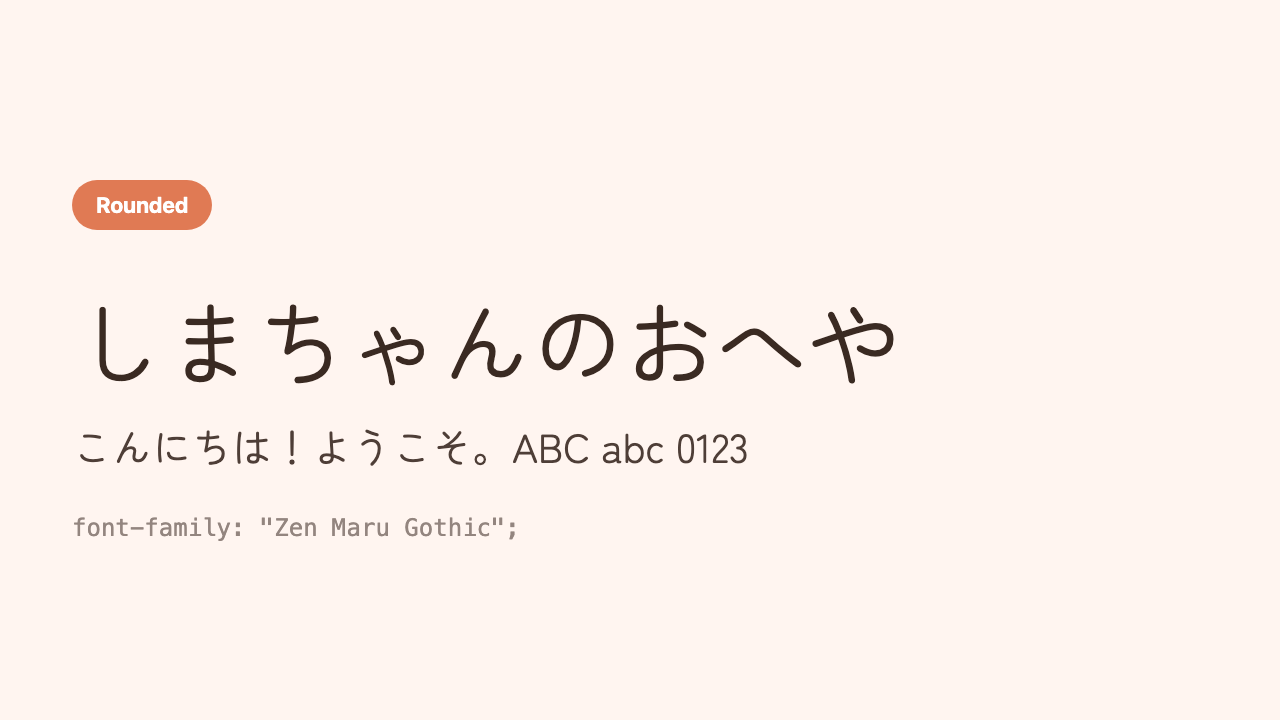
Zen Maru Gothic
A plump, refined rounded gothic with open, roomy letterforms.
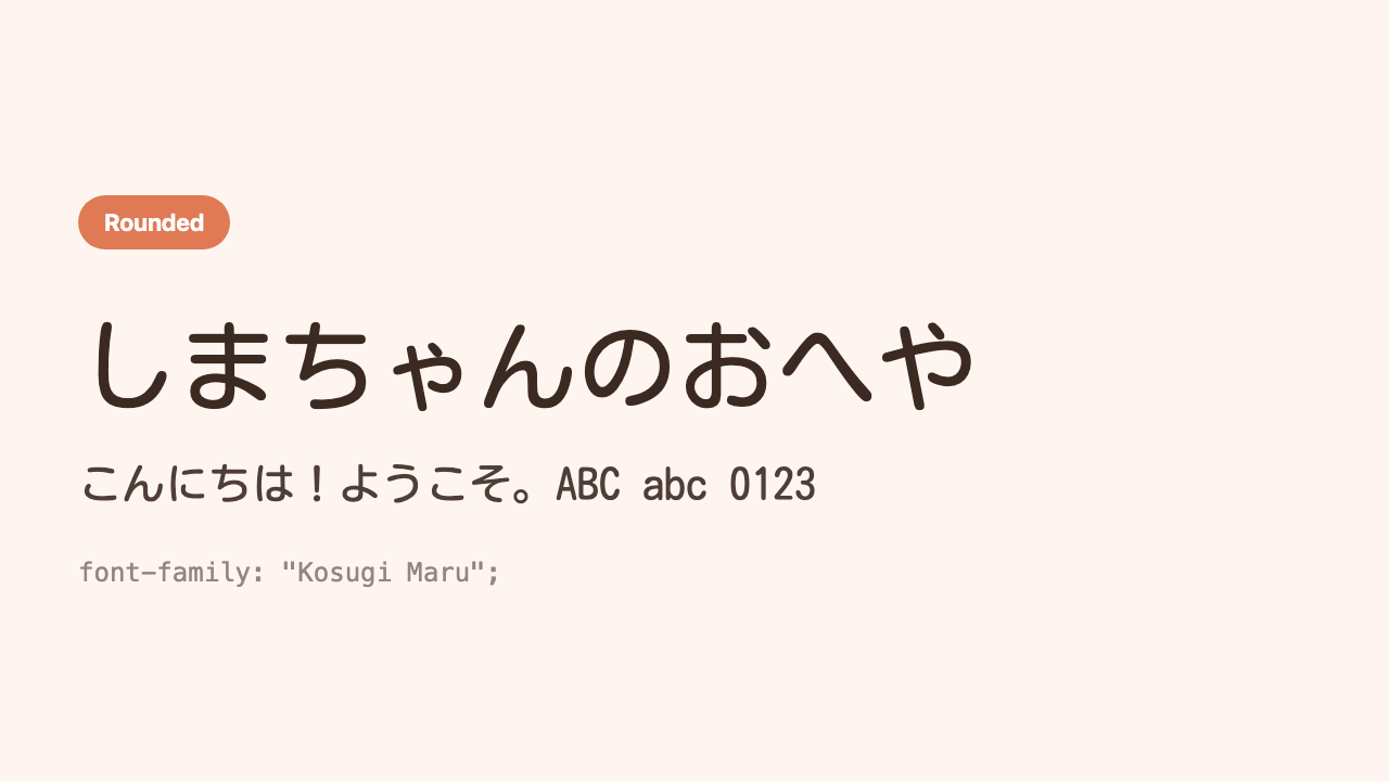
Kosugi Maru
A light, thin rounded gothic. Crisp and cute.
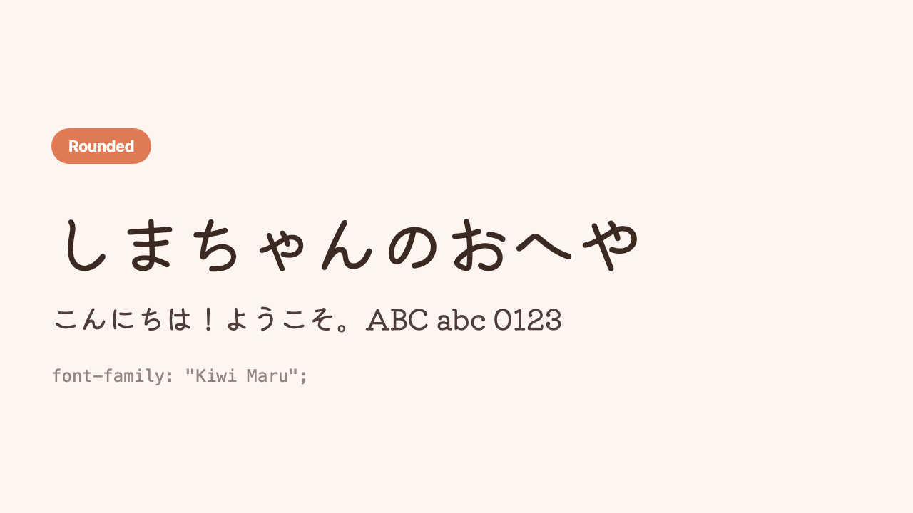
Kiwi Maru
A retro, soft rounded gothic that looks almost like a stamp.
Type 2: Crisp and readable (gothic)
Gothic (sans-serif), with little decoration, is a safe type that never misses in any situation. It doesn’t tire you out even over long text, and gives a serious, clean impression. The top pick for “if you’re adding just one.”
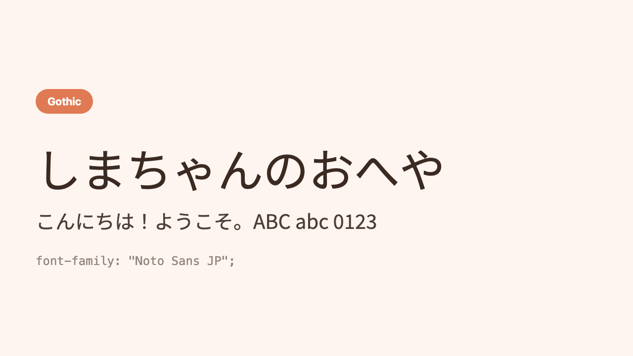
Noto Sans JP
A world-standard Japanese gothic made by Google. When in trouble, this is a sure bet.
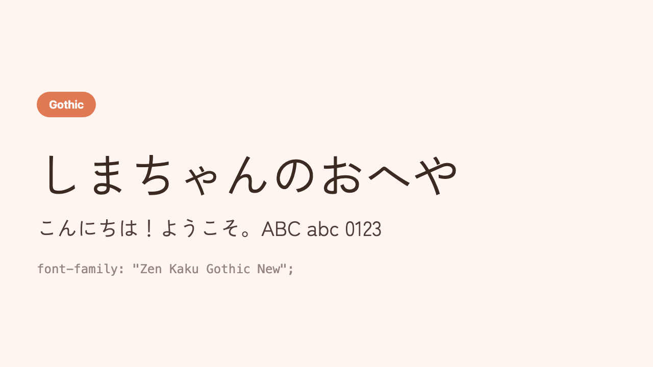
Zen Kaku Gothic New
A modern, beautiful gothic that carefully refines the angular gothic style.
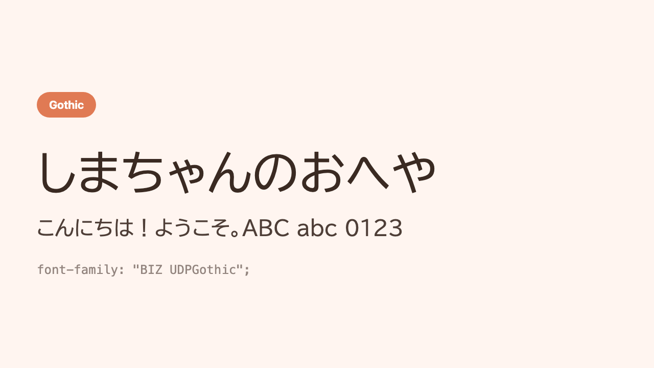
BIZ UDPGothic
A “universal design” font. Designed to be readable for everyone.
Type 3: Refined and graceful (mincho)
Mincho (serif), with thick vertical strokes and sweeping tails, is grown-up and refined. It works when you want a calm mood or a Japanese, upscale feel. Used in headings, it really tightens things up.
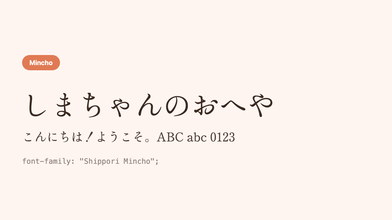
Shippori Mincho
As the name “shippori” (mellow) suggests, a mellow, beautiful mincho. For Japanese-style pages.
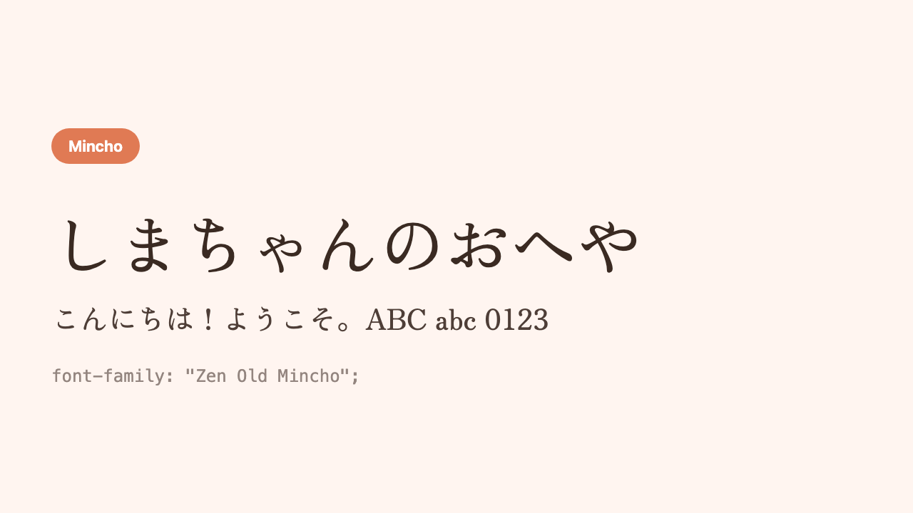
Zen Old Mincho
An orthodox mincho reminiscent of the mincho in old-fashioned books.
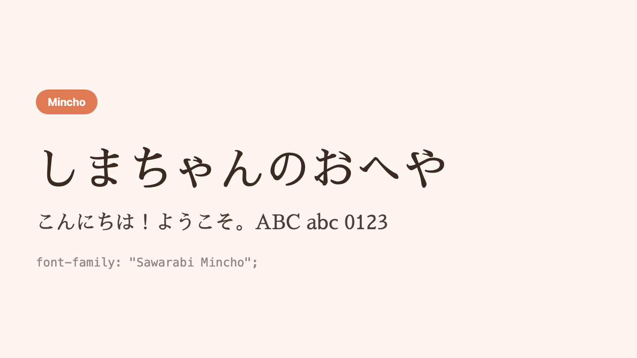
Sawarabi Mincho
A light, modern mincho with thinner lines.
Type 4: Handwritten and cute
Handwritten-style fonts that look as if a person wrote them. Soft, warm, and friendly. Used in headings or one-line messages, they instantly bring out a “handmade” feel.
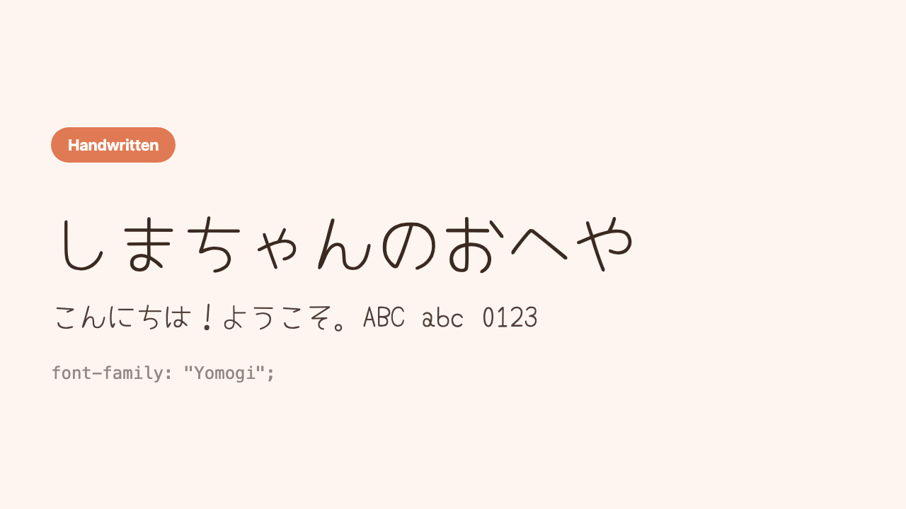
Yomogi
A loose, cute handwriting like soft pencil writing.
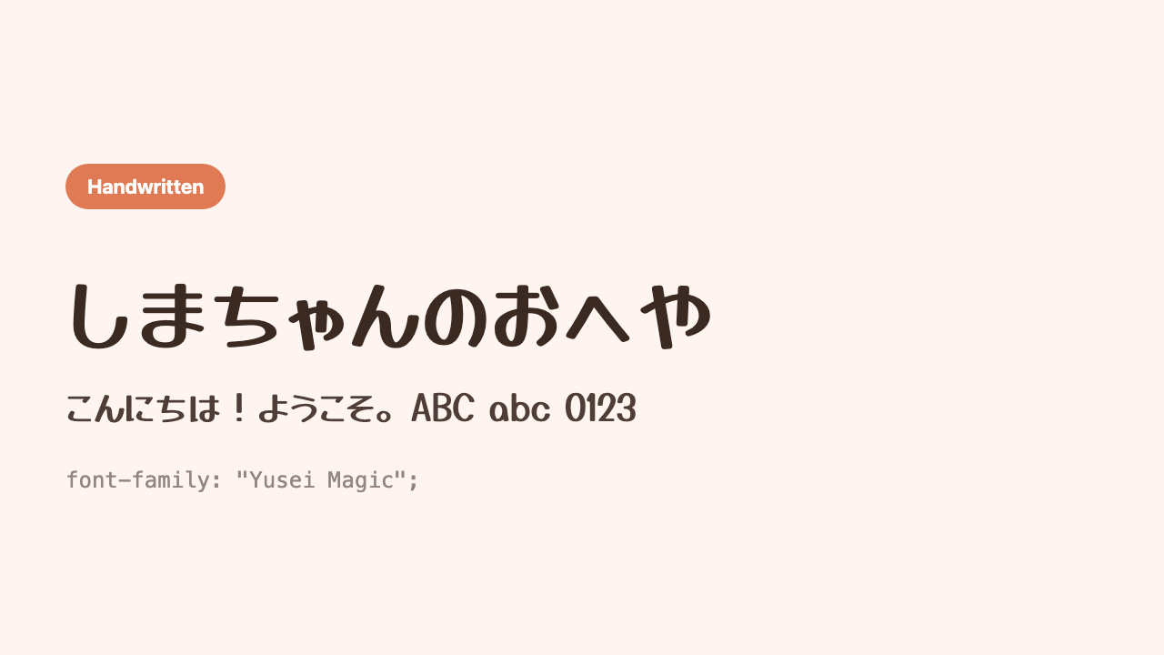
Yusei Magic
A cheerful, pop handwriting like it was written with a marker.
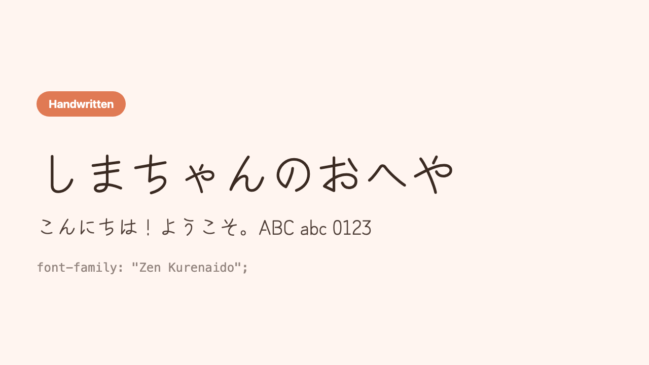
Zen Kurenaido
A natural handwriting like a quick note with a ballpoint pen.
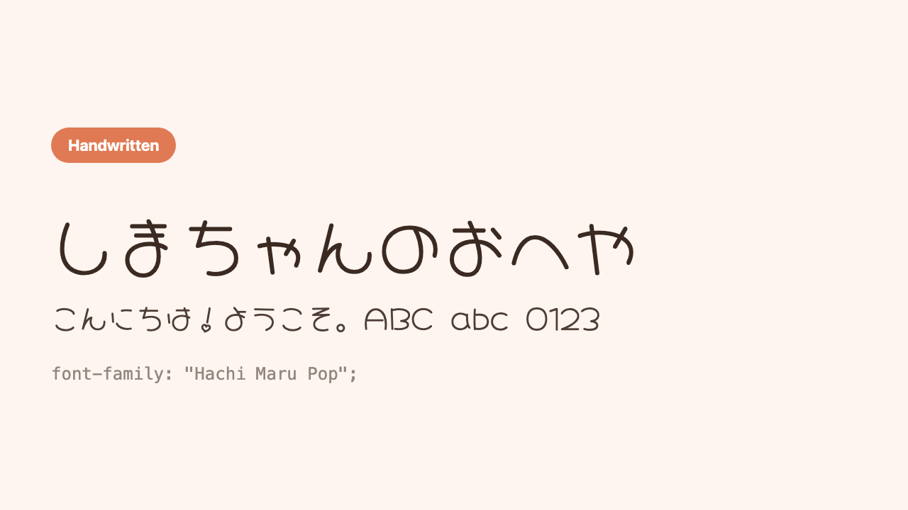
Hachi Maru Pop
A manga-style, plump, cute handwriting. Sweet through and through.
Type 5: High impact (for headings and titles)
Very bold or very distinctive, heading-only types. They’re hard to read in body text, so the trick is to use them only for titles, logos, or a single line you want to stand out. Nail one spot and the whole thing tightens up.
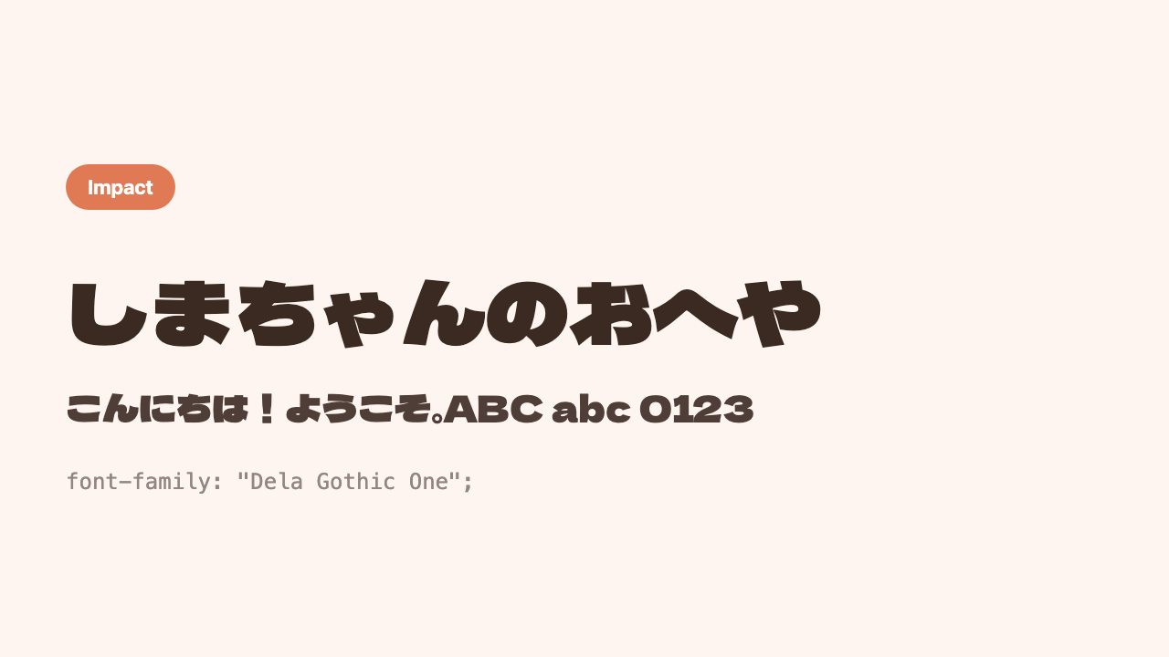
Dela Gothic One
An over-the-top thick, ultra-heavy gothic. It just stands out.
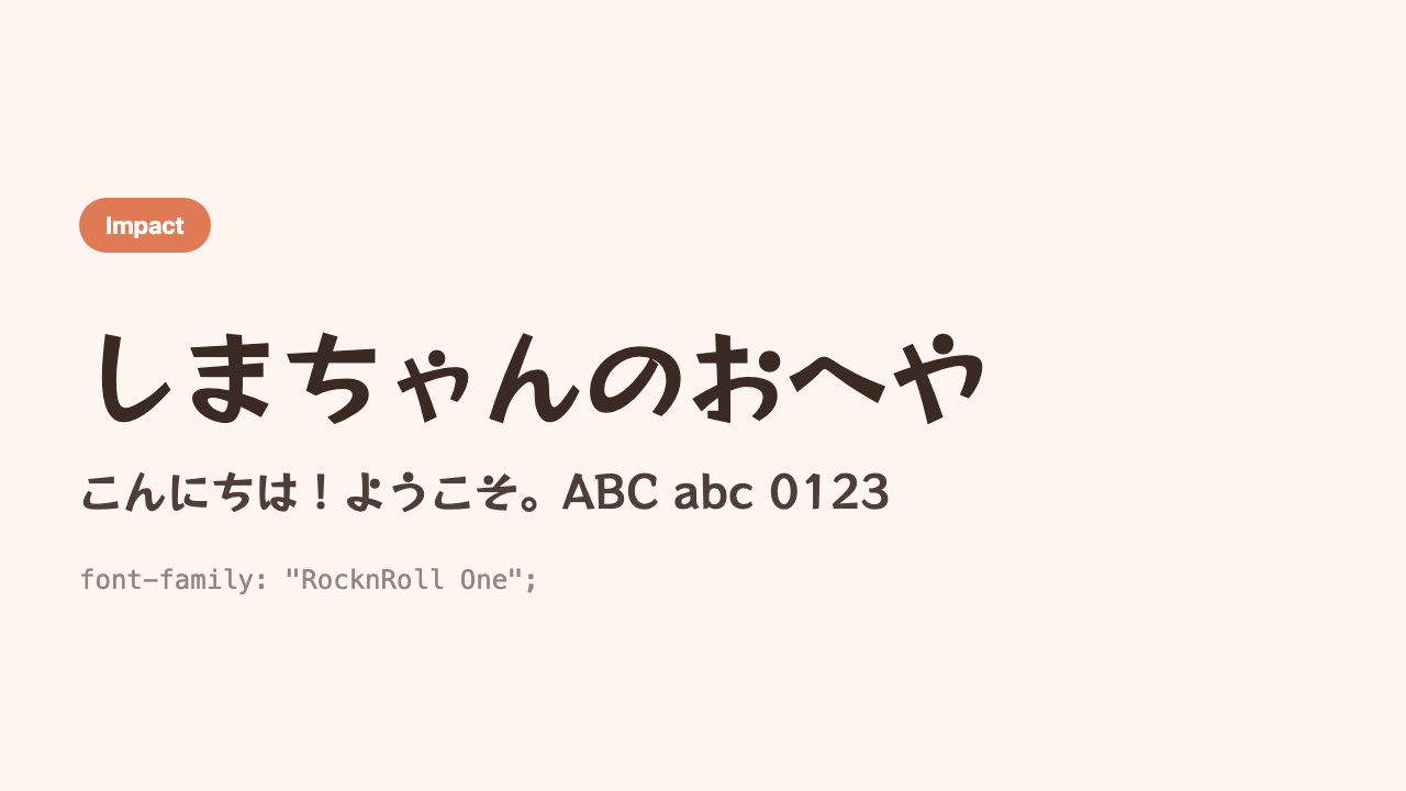
RocknRoll One
A thick, round-cornered, cheerful pop heading font.
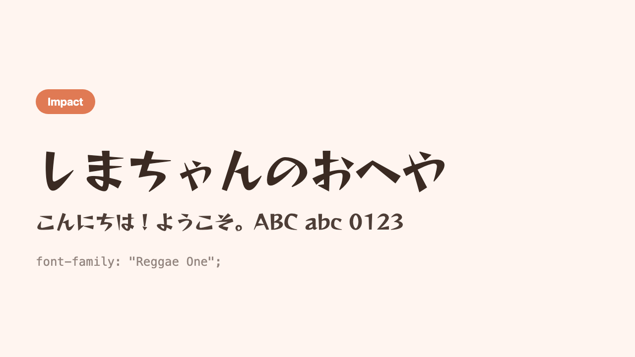
Reggae One
A graffiti-style heading font, quirky and cool.
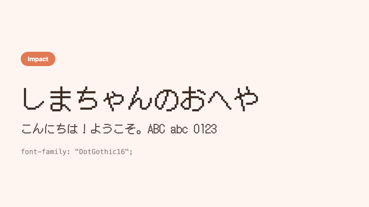
DotGothic16
A retro font drawn in dots, like an old video game.
Type 6: Stylish Latin fonts (for logos and headings)
They don’t apply to Japanese, but for an English logo or title, these Latin-only fonts make things much more stylish. Try adding one to a short English phrase, like a site name or a section name.
Poppins
A trendy, popular sans-serif that’s perfectly round and geometric.
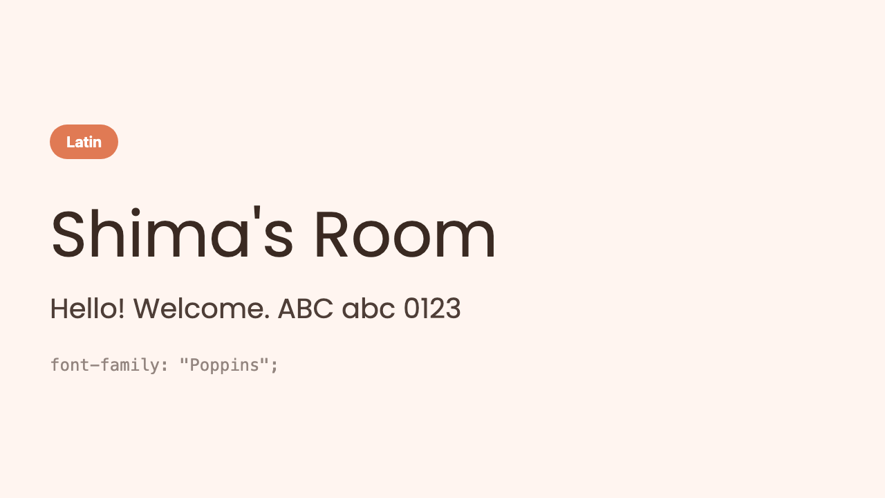
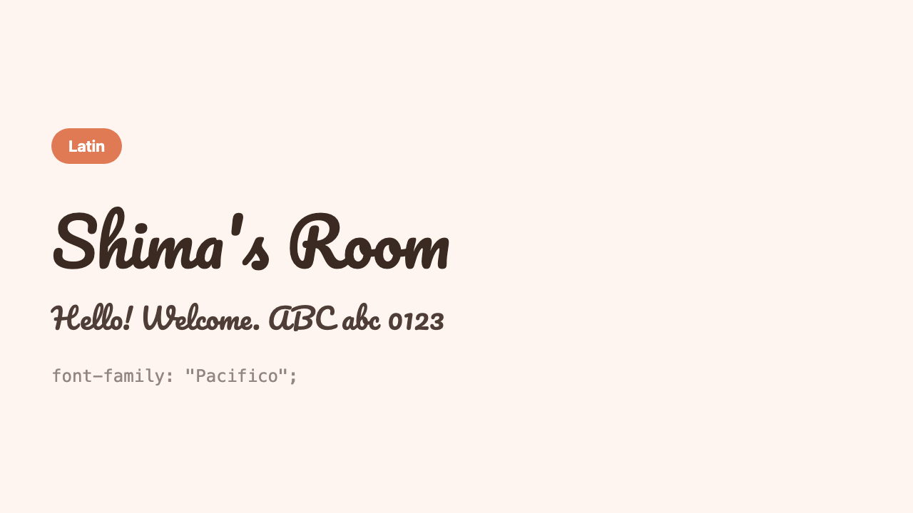
o is perfectly round and cute. A classic for making an English site name or button look stylish.Pacifico
A smooth script. Like a signature, it gives a polished, easygoing impression.
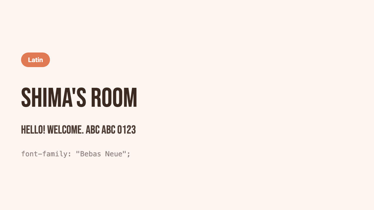
Bebas Neue
A tall, stylish, all-uppercase font.
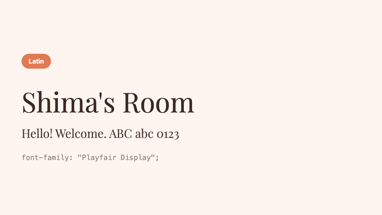
Playfair Display
A refined, classic serif (mincho-like). For when you want an upscale feel.
3 tips for choosing
We’ve looked at a lot, but when it comes to actually using them, keeping just these in mind is enough.
| Tip | What it means |
|---|---|
| It’s OK to split body and heading | A readable gothic for the body, a font you like for just the headings—this rarely fails |
| Use 2 kinds at most | Mixing many makes it messy. Loading gets heavy too |
| Choose by mood | Gentle = rounded gothic, refined = mincho, cheerful = handwritten; pick by feel and you’re fine |
Sample combinations (heading × body)
If you’re combining 2 kinds for heading and body, here are reliable, low-risk classic pairs chosen from this article.
| Mood to create | Heading | Body |
|---|---|---|
| Gentle and cute | Kiwi Maru | M PLUS Rounded 1c |
| Clean and trendy | Zen Kaku Gothic New | Noto Sans JP |
| Japanese and refined | Shippori Mincho | Noto Sans JP |
| Cheerful and pop | Dela Gothic One | Zen Maru Gothic |
| English logo + Japanese body | Poppins | Noto Sans JP |
Actually, pulling it together with different weights of the same font (bold for headings, thin for body) is a proper combination too. Since you’re not adding kinds, loading stays light and the unity doesn’t break.
Tips to keep Japanese fonts from getting heavy
Japanese fonts have vastly more characters—hiragana, katakana, kanji—so their files are larger than Latin fonts. That said, Google Fonts delivers only the chunks of characters actually used on the page, split into small pieces, so for normal use you don’t need to worry too much. There are only 2 things to keep in mind.
- Choose only the weights (thicknesses) you use—two, one for body and one for headings, is plenty rather than every step
- 1 to 2 kinds at most—3 or more kinds tends to make the design messy too
Summary
- Choosing Google Fonts by type keeps you from freezing up—rounded gothic / gothic / mincho / handwritten / high-impact / Latin
- A readable gothic for the body and a font you like for just the headings is the golden, low-risk pattern
- Use 1 to 2 kinds at most. It’s fine to pick casually by mood
Once your one “I like this” is decided, the world of your page springs to life all at once.