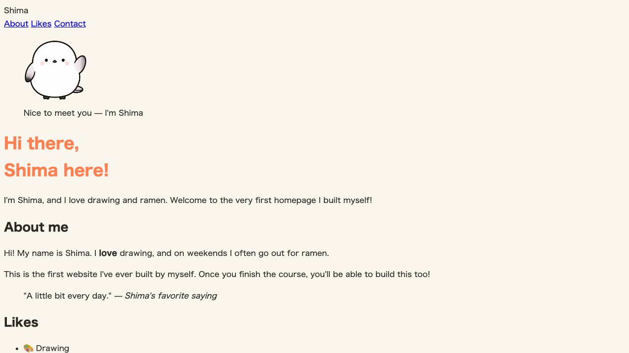
Just adding color already made it feel like “your own page,” but the typeface of the text itself also greatly shapes the impression. An angular typeface feels crisp; a rounded one feels gentle. What controls this typeface is font-family.
Let’s write it
body {
  font-family: "Hiragino Sans", "Helvetica Neue", Arial, sans-serif;
}
Separated by commas, several font names are lined up. This is a candidate list meaning “first look for the first one; if it’s not there, the second; and if not that, the third….” Since which fonts are installed varies from computer to computer and phone to phone, lining up candidates like this makes it look close to the same on any device.
| What you write | Role |
|---|---|
"Hiragino Sans" | A Japanese font installed on Macs (first choice) |
"Helvetica Neue" | The runner-up when that isn’t found (a Latin font) |
Arial | If that’s missing too, this one |
sans-serif | The last line of defense. A generic name meaning “just any typeface that isn’t serif” |
Wrap fonts whose names have spaces in quotes
For fonts with a space in the middle of the name, like "Hiragino Sans", wrap them in " ". For generic names like sans-serif (words that are conventionally written without quotes), don’t add quotes.
The reason to list several candidates is that which fonts are installed differs by OS. For example, "Hiragino Sans" is a typeface installed only on Macs. On a Windows computer it isn’t found, so it moves on to the next candidate ("Helvetica Neue"→and if that’s missing too, Arial). If you want the Japanese to look nice on Windows as well, it’s reassuring to add a candidate like "Yu Gothic" (Yu Gothic, the standard Japanese typeface on Windows) to the list.
Always finish with a generic family
The standard is to place a generic family without quotes—like sans-serif (a sans-serif typeface) or serif (a serif typeface)—at the very end of the candidate list. Even if none of your listed candidates are found, the browser always has this generic one, so a minimum typeface is guaranteed.
How much the typeface changes the impression
Even for the same text, just changing font-family completely changes the impression you get. Here are three representative ones side by side.
sans-serif), serif (serif), and monospace (monospace). Even with the same content, the typeface shifts the expression between “crisp,” “soft,” and “mechanical.”Tidy up the line height at the same time
One more thing while you’re deciding the font. When text runs to two or more lines, the gap between lines is controlled with line-height.
body {
  font-family: "Hiragino Sans", "Helvetica Neue", Arial, sans-serif;
  line-height: 1.7;
}line-height: 1.0, the bottom is line-height: 1.7. Even for the same text, just widening the gap between lines makes it much easier to read.1.7 is a number (with no unit) you can picture as “1.7 times the text size.” Cramped line spacing is hard to read, and too much makes it feel stretched out. Around 1.5 to 1.8 is a good guide for readable line spacing.
When you want the same typeface on every device
The font specifications so far have been a way of using the typefaces installed on the viewer’s computer or phone. Separately from that, a website can actually deliver the font data itself. This is a “web font,” and the flagship example is the free-to-use Google Fonts. It’s also a solution for when none of your candidate list is found and the page falls back to a generic family.
TipsChange the face of your text with Google FontsHow to use Google Fonts is covered in this handy tipSummary of this lesson
- The typeface is
font-family. List several candidates, separated by commas - Wrap names containing spaces in
" " - Always finish with a generic family like
sans-serif - Line spacing is
line-height(around1.5to1.8is a good guide)