
VSCode comes with a readable font from the start, but the longer you spend writing code, the more the difference between fonts matters. How easy 0 (zero) and O (oh) are to tell apart, how easy l (ell), 1 (one), and I (eye) are to tell apart, the “ligatures” that turn a symbol like => into a single connected arrow, and even how Japanese comments look — fonts made for coding are designed with nothing but reading and writing code in mind. Here are free recommendations, by type, with samples.
How to change the font in VSCode
- Open Settings with
⌘,(on Windows,Ctrl+,) - Type “Font Family” in the search field
- In the field that appears, enter the font name (leaving
monospaceat the end, like'Fira Code', monospace, serves as a fallback when loading fails)
If you write it directly in settings.json, it’s these two lines. For fonts that use ligatures, also turn on fontLigatures.
{
  "editor.fontFamily": "'Fira Code', monospace",
  "editor.fontLigatures": true
}
How to install a font
Unlike web fonts, fonts used in an editor need to be installed on the computer itself. That said, the steps are simple.
- Download it — for those distributed on Google Fonts, get the zip from the font page via “Get font” → “Download all”; for those distributed on GitHub (like PlemolJP and UDEV Gothic), from the repository’s Releases page
- Unzip it and double-click the
.ttf(or.otf) file inside - On the screen that opens, press “Install” (on Mac, Font Book opens; on Windows, a preview screen opens)
Once installed, restart VSCode. Now you can specify it as the font name in your settings.
Good compatibility with Japanese (matching typeface all the way to comments)
Latin-only fonts have their typeface change completely the moment you hit a Japanese comment. The five introduced here carry Japanese characters themselves, so Latin and Japanese align in the same typeface.
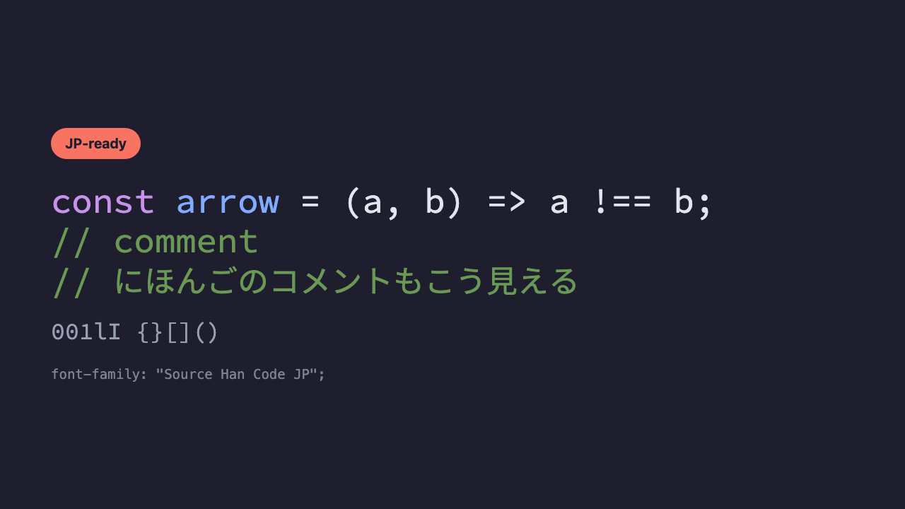
Source Han Code JP
The original of Japanese coding fonts, made by Adobe. It combines the Latin Source Code Pro with the Japanese Source Han Sans (same design as Noto Sans CJK). When in doubt, this one. Updates stopped in 2020, but since it’s a finished typeface there’s no practical problem. If you’d prefer something actively updated, go with PlemolJP or UDEV Gothic below.
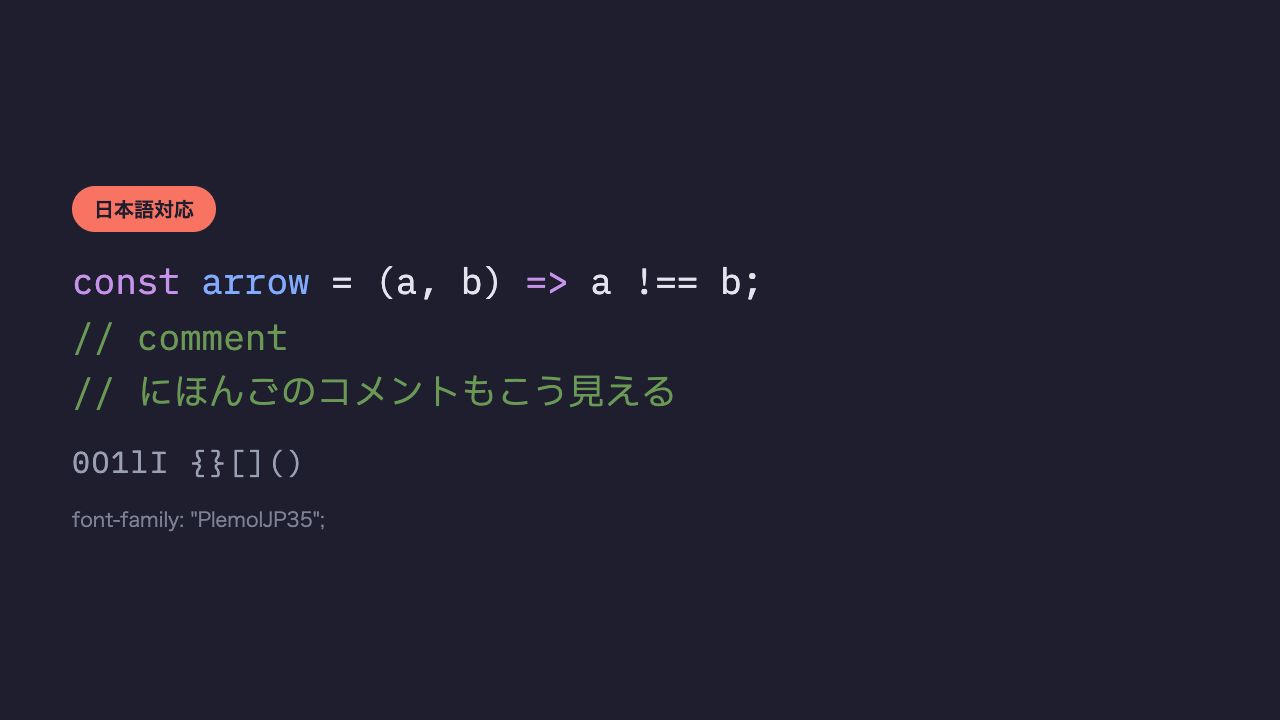
PlemolJP
A popular font, actively updated, that combines IBM Plex Mono and IBM Plex Sans JP. Its half-width to full-width ratio of 1 to 2 makes it easy to align things with tabs.
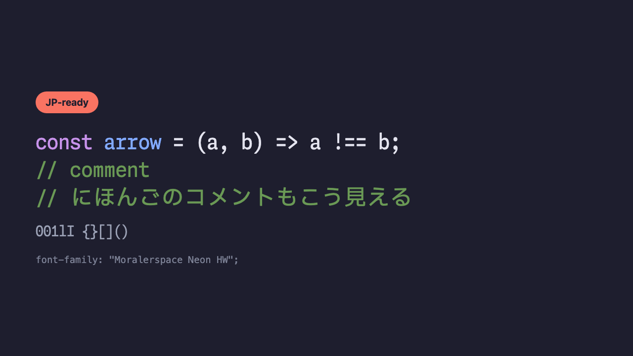
Moralerspace Neon
A relatively new Japanese coding font that combines Monaspace with a Japanese font. With “texture healing” inherited from Monaspace, it also balances out tight character spacing.
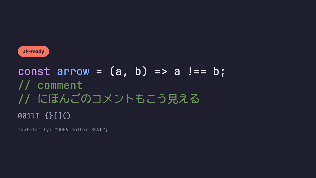
UDEV Gothic 35NF
A popular Japanese coding font that combines JetBrains Mono-based Latin with BIZ UDGothic-based Japanese. The “35” expresses the character-width ratio of half-width 3 to full-width 5 (the standard version is 1:2).
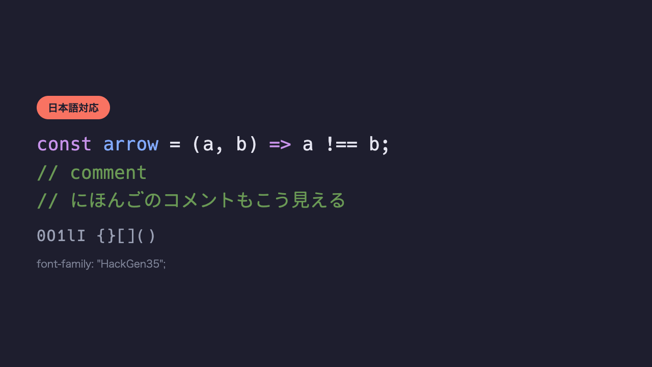
HackGen35
A font combining the staple coding font “Hack” with the Japanese gothic “GenJyuu Gothic.” Another popular pick, by the same author as UDEV Gothic.
Staple / readability-first
Classic coding fonts with little decoration. Made with an emphasis on not tiring you out even after reading code for long stretches.
JetBrains Mono
A font JetBrains designed with the goal of “reducing the strain on developers’ eyes.” Its characters are uniform in height, so lines are less likely to feel cramped and hard to read.
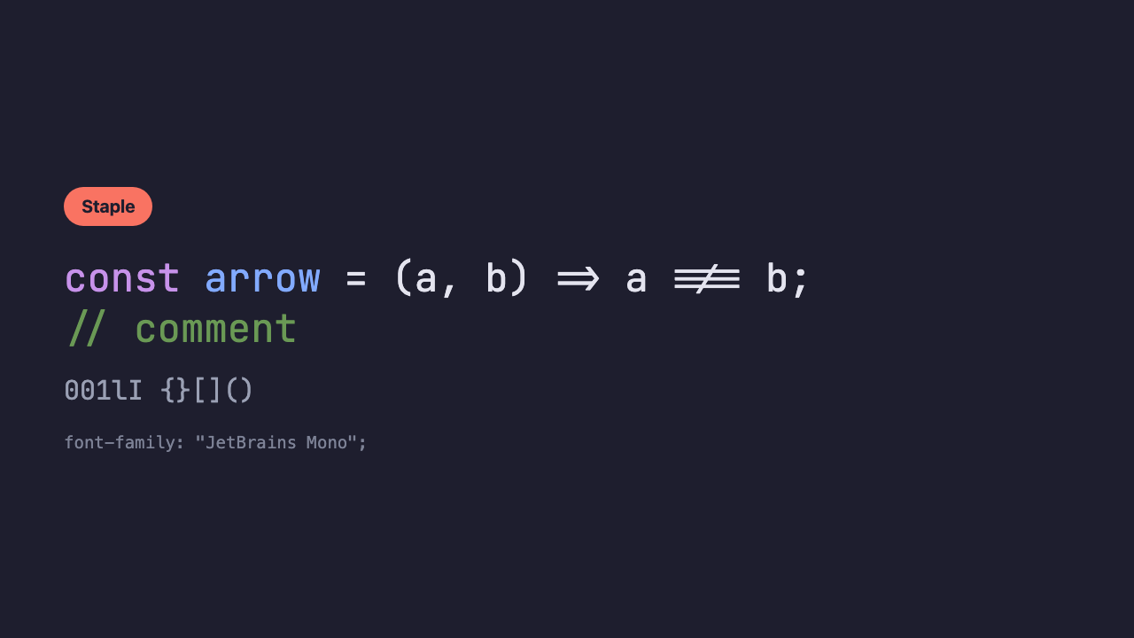
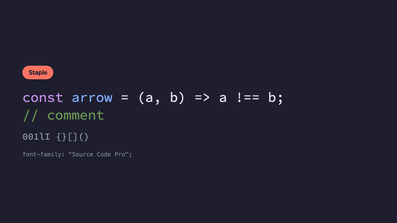
=> and !== become single connected symbols. When in doubt, this one first.Source Code Pro
A classic coding font made by Adobe. It has no quirks and fits any editor or theme.
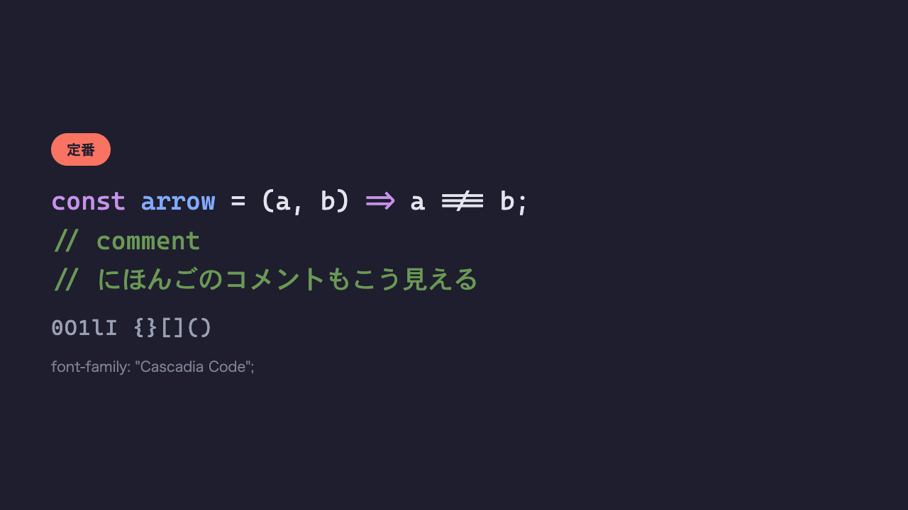
Cascadia Code
Made by Microsoft and bundled by default with Windows Terminal and Visual Studio. If you use Windows Terminal, you may already have it on hand. It isn’t bundled with VSCode, so you’ll need to install it to use it.
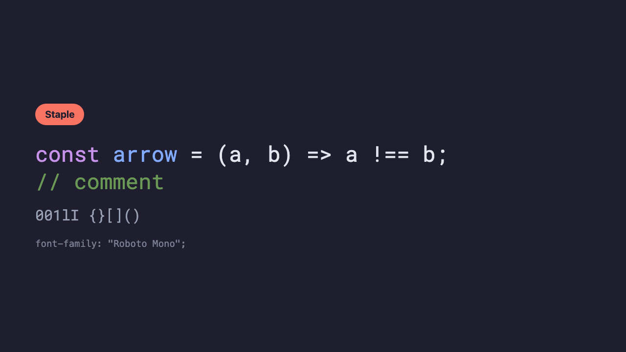
Roboto Mono
The monospace version of the Roboto family, made by Google. Familiar around Android and Chrome, with a straight, strong impression.
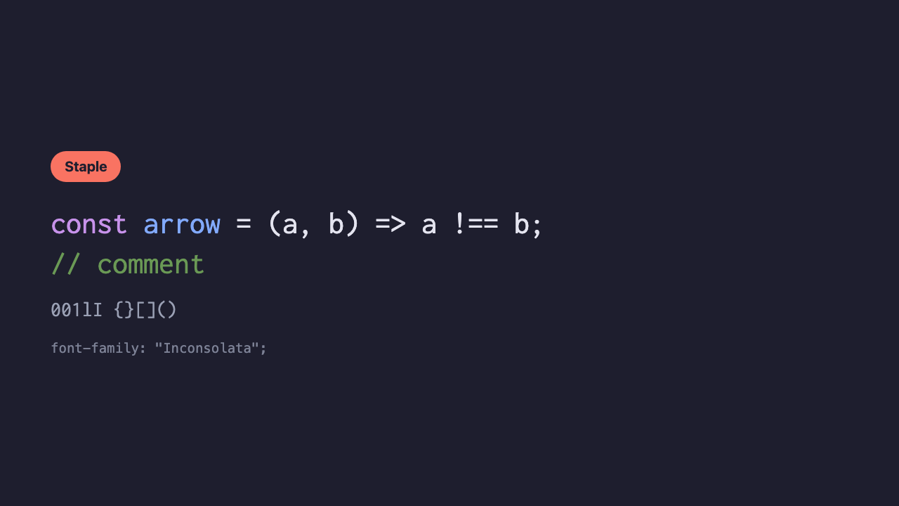
Inconsolata
A slim, elegant, minimal type long loved in the coding-font scene.
Ligatures make symbols look sharp
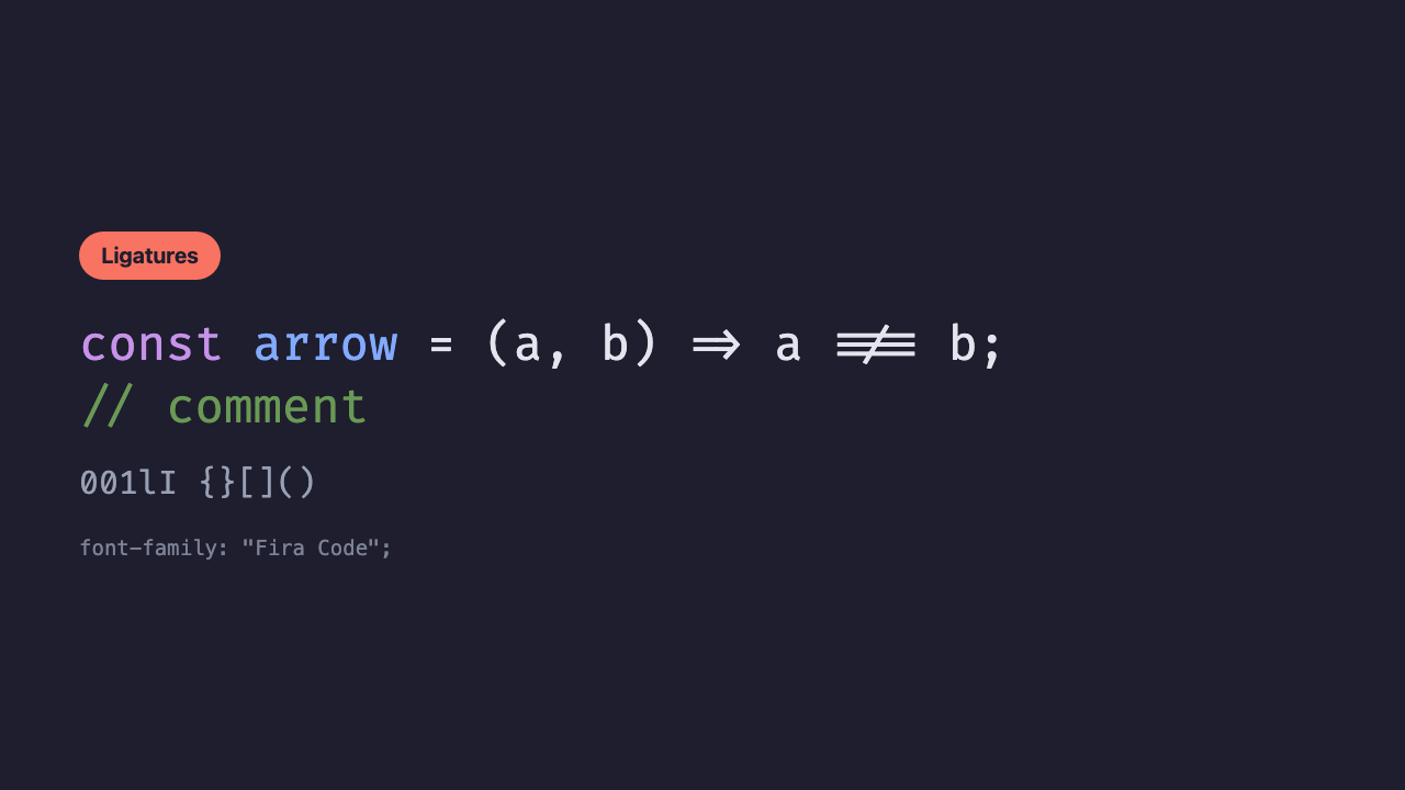
Ligatures are the feature where multiple symbols like => or !== merge into a single connected shape. The meaning of the code comes across at a glance through the shape of the symbol.
Fira Code
The one that sparked the ligature coding-font trend. Its arrow and equals ligatures have very natural shapes.
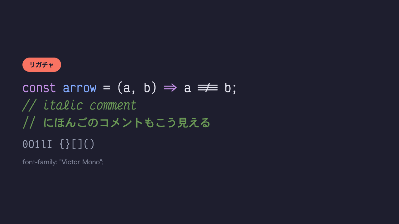
Victor Mono
Its biggest distinction, on top of ligatures, is being able to display comment sections in a cursive-like italic.
Want a bit of personality
A type that keeps readability while having character in the shapes of the letters. Your mood lifts every time you open the editor.
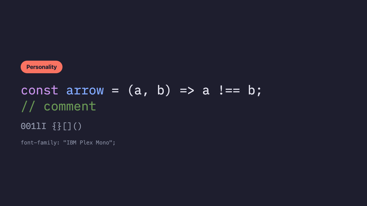
IBM Plex Mono
The monospace version of IBM’s brand font family. Its corners are soft, giving a modern, elegant impression.
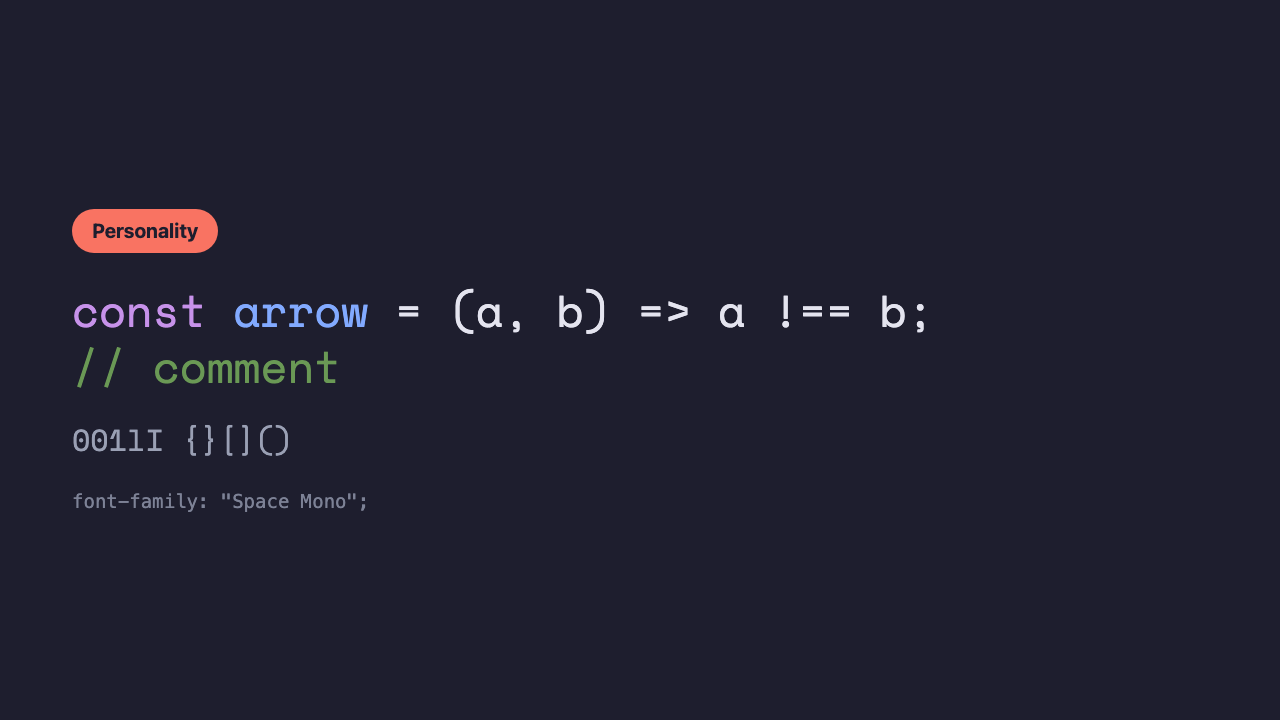
Space Mono
A retro, rugged monospace font like a typewriter. Its angular brackets and quirky letterforms are its strong points.
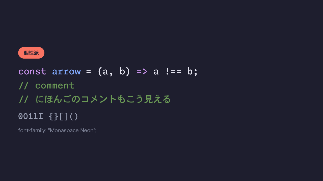
Monaspace Neon
A relatively new coding-font family developed by GitHub. It’s characterized by a mechanism called “texture healing” that mixes five typefaces, and Neon is the mainstay type among them with the fewest quirks.
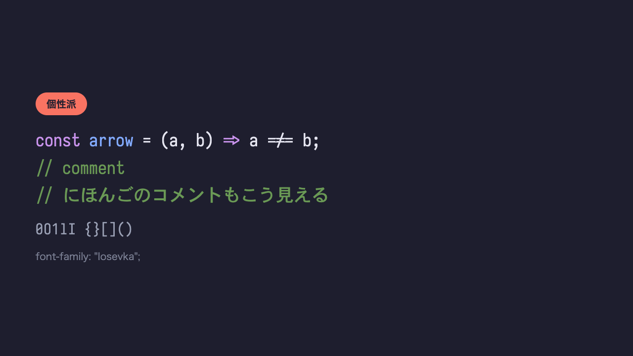
Iosevka
A surprisingly slim, tall coding font. It offers a wide range of customization, and it’s a family that many people tweak to their own preferred weight and width.
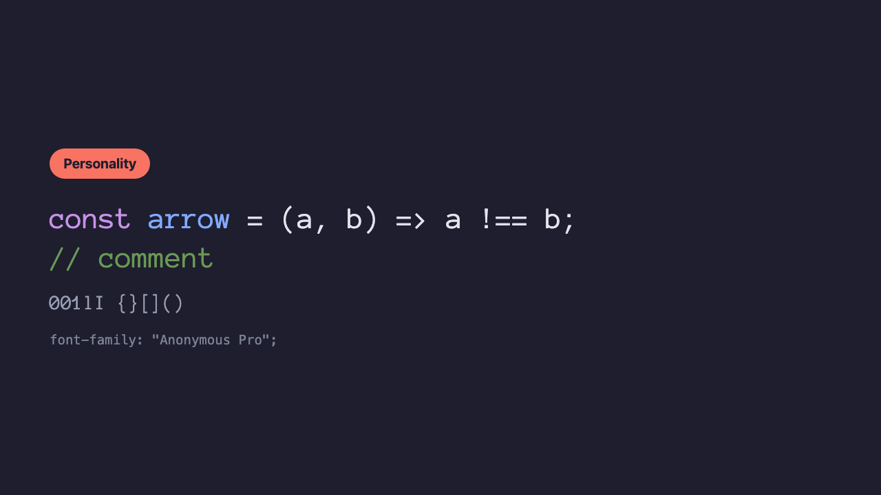
Anonymous Pro
As the name suggests, a monospace font with a plain, anonymous look. It has the unadorned feel of an old-fashioned terminal.
Points to check when choosing
On top of which look you prefer, comparing these four helps you find the one font that suits you.
| Check | What to look at |
|---|---|
| Confusing characters | Can you tell 0 and O, 1, l, and I apart at a glance? |
| Ligatures | Do you want ligatures for arrows and such, or do you prefer symbols to stay as symbols? |
| Japanese comments | Do you want to match the typeface all the way to Japanese? |
| Character width | If you want to fit lots on one line, a slim type like Iosevka |
Summary
- A coding font is a different thing from a font for web pages. It’s made with nothing but reading and writing code in mind—things like how easy
0andOare to tell apart - When in doubt, the staple JetBrains Mono; if you want to enjoy symbol ligatures, Fira Code; if you want to match the typeface all the way to Japanese comments, Source Han Code JP
- The VSCode setting is just one line,
editor.fontFamily. For fonts that use ligatures, don’t forgeteditor.fontLigaturestoo