
CSS・Arranging and positioning

Line things up in a Grid with Grid

A grid lined up neatly across and down is Grid's specialty. Decide how many columns in a single line, and cards line up like tiles.

Like a photo gallery or product cards, you want to make a grid neatly lined up across and down. What shows its strength there is Grid. Where Flexbox is good at “lining things up in one row,” Grid is good at laying things out in a grid pattern.

Decide how many columns

Just like Flexbox, you wrap the things you want to line up in a parent and put display: grid; on that parent. The difference is where you write the column design.

.parent {
  display: grid;
  grid-template-columns: 1fr 1fr 1fr;
  gap: 16px;
}

grid-template-columns: 1fr 1fr 1fr; means “make three equal columns.” fr is a unit of “proportion,” so 1fr 1fr 1fr splits evenly into three. The parts inside fill into that grid neatly, top to bottom in order.

Place six boxes and they wrap at three columns into a two-row grid. Just decide the number of columns, and the rest lines up like tiles automatically.

1fr 1fr 1fr makes three columns’ worth of “slots,” and A → B → C → D… fill in from the top in order.

You can distribute column widths freely

Change the fr numbers and you can also change the distribution of column widths.

.parent {
  display: grid;
  grid-template-columns: 2fr 1fr;
  gap: 16px;
}

This is “two columns, wider on the left (2), narrower on the right (1).” Since fr divides the remaining space by ratio, it grows and shrinks while keeping the proportion, even when the screen size changes.

Change the fr numbers and the distribution of column widths changes right along with them. Let’s compare.

The ratio of the numbers is exactly the ratio of the widths. With 2fr 1fr, the left box comes out exactly twice as wide as the right.
CSSLine things up with FlexboxRecall Flexbox for lining things up in a row — its specialty is different from Grid’s

fr ratios can be decimals too

Besides whole-number ratios like 2fr 1fr, you can also specify decimals, like 1.05fr 0.95fr.

.hero {
  display: grid;
  grid-template-columns: 1.05fr 0.95fr;
}

When an exact half of 1fr 1fr looks a little mechanical, making the left just a touch wider — decimal fr is handy for that kind of subtle adjustment. The meaning of the numbers themselves is the same as with whole numbers: they just divide up by ratio.

Aligning parts within a cell of the grid: justify-items / justify-self

Grid also has tools for deciding how to align a part within a cell of the grid.

.parent {
  display: grid;
  justify-items: start;
}

justify-items goes on the parent and aligns all the children by “where to place them within the cell” (start = left, center = middle, stretch = fill the whole cell, the default). When you want to align just one child on its own, put justify-self on that child itself.

.btn {
  justify-self: start;
}

justify-items is everyone all together, justify-self is that child alone — the difference is aligning at the parent, or changing just the one child.

With the default stretch, a part spreads to fill the cell; with start, it shrinks down to the width of its content and moves to the left. Only the one with justify-self can be aligned differently from the rest.

The light color is the size of the cell. stretch fills the cell with the box, start pulls it to the left at the width of its content. Set just one to justify-self: center and only that box comes to the middle of its cell.

Summary of this lesson

  1. Decide the number of columns with display: grid; plus grid-template-columns on the parent
  2. fr is a unit of proportion (1fr 1fr splits evenly into two; you can use decimals too)
  3. Choose by role: one row means Flexbox, a grid means Grid
  4. justify-items (parent, everyone) / justify-self (child, just one) decide the alignment within a cell
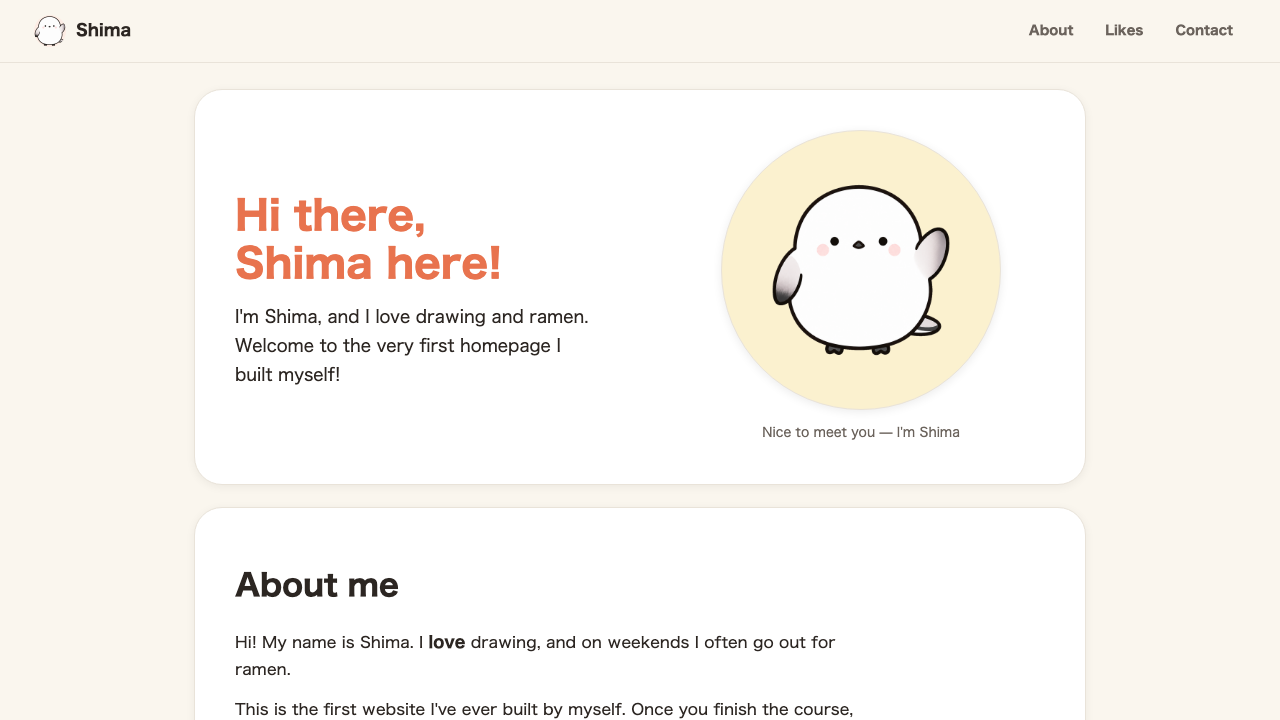
Try it: build the whole page, the hero, and the favorites into grids

Put class="wrap" on <main>. Then make a new <section class="card hero"> that gathers the photo, name, and greeting text together, and wrap just the name and greeting text in a <div class="hero__body">.

<main class="wrap">
  <section class="card hero">
    <div class="hero__body">
      <h1 class="hero__title">Hello, I'm<br><span class="name">Shima</span>.</h1>
      <p>I'm Shima, and I love drawing and ramen. Welcome to the homepage I made myself for the very first time!</p>
    </div>
    <figure class="hero__art">
      <div class="hero__disc">
        <img src="/shima/hand.png" alt="Photo of Shima">
      </div>
      <figcaption class="hero__caption">Nice to meet you, I'm Shima</figcaption>
    </figure>
  </section>
  ...
</main>

We put class="hero__title" on the heading too. The size and color we’d been setting on the whole h1 tag now move over to a real class, .hero__title.

.wrap {
  max-width: 940px;
  margin: 0 auto;
  padding: 26px 24px 44px;
  display: grid;
  gap: 22px;
}
.hero {
  display: grid;
  grid-template-columns: 1.05fr 0.95fr;
  align-items: center;
  gap: 36px;
}
.hero__body {
  display: grid;
  gap: 16px;
  justify-items: start;
}
.hero__title {
  font-size: 40px;
  font-weight: bold;
  line-height: 1.2;
}
.hero__title .name {
  color: #e8734e;
}
.likes__grid {
  display: grid;
  grid-template-columns: 1fr 1fr 1fr 1fr;
  gap: 14px;
}
.contact-form {
  display: grid;
  gap: 12px;
  max-width: 420px;
  margin: 20px auto 0;
  text-align: left;
}
.contact-form .btn {
  justify-self: start;
}

Add class="likes__grid" to the favorites <ul> and class="contact-form" to the contact <form> the same way. .wrap is a grid that centers the whole page, .hero puts the photo and text in two columns, .likes__grid puts the favorites in four columns, and .contact-form is a grid that stacks the input fields vertically. Only .btn gets justify-self: start; to align it left within the form.

The same “grid that stacks vertically” works for the self-introduction body too. Let’s wrap the two <p> in a <div class="about__text">.

<div class="about__text">
  <p>Hi! My name is Shima. I love to draw, and on weekends I often go out for ramen.</p>
  <p>This page is the first website I made by myself. If you build it all the way through, you can make this too!</p>
</div>
.about__text {
  margin-top: 18px;
  font-size: 16px;
  max-width: 60ch;
  display: grid;
  gap: 12px;
}
.about__text p {
  margin: 0;
}

The same idea works for the <label> inside .contact-form too. Let’s stack the label’s text and the input field neatly, vertically.

.contact-form label {
  display: grid;
  gap: 6px;
  font-weight: bold;
  font-size: 13px;
}

Thanks to gap, a natural gap forms between each <p>, and between the label’s text and its input field. Grid is very well suited not just to “simply lining up” paragraphs and parts, but also to “stacking them readably, not too cramped.”

Browser view. The whole page is centered, the hero is in two columns, the favorites in a four-cell grid, and the self-introduction body and contact form labels line up neatly with gaps between them
The scattered pieces each settle into their own tidy grid.

Now you have two tools for lining things up. Last comes position, for layering parts and pinning them to the screen — the finishing touches of layout.

FAQ

How do I choose between Flexbox and Grid?
As a rule of thumb: Flexbox for lining up in one direction (just across or just down), Grid for a grid that's neat both across and down. Menu and button rows suit Flexbox; tiling cards suits Grid.
What kind of unit is fr?
It's a unit for Grid that divides up the remaining space by ratio. 1fr 1fr splits it in half; 2fr 1fr splits it two-to-one. The proportion holds even when the screen size changes.
I set the columns, but how are the rows decided?
Rows increase automatically. When the columns set by grid-template-columns fill up, the next row is created automatically and the rest lines up there. Row height stretches to fit the content.