A header that stays pinned to the top as you scroll, a badge nudged slightly on top of something, a button fixed to the corner of the screen—these “placed outside the normal flow” layouts are what position makes possible. Where Flex and Grid line things up, think of position as the one that floats and pins them.
Start with fixed: pin it to the screen
The easiest use to picture is fixed. It doesn’t move as you scroll—it stays stuck to the screen. A header pinned to the top is the classic example.
.header {
  position: fixed;
  top: 0;
  left: 0;
  width: 100%;
}
top: 0; left: 0; pins it “relative to the top-left of the screen,” and width: 100% stretches it all the way across. No matter how far you scroll the page, the header stays where you can always see it.
This one, too, is best seen in motion. Try scrolling inside the box below. Only the blue header stays stuck at the top, while the text behind it flows past.
padding-top on .body-inner is the space that keeps the top of the body text from being hidden behind the fixed header.sticky: flows normally, then sticks when you reach it
sticky is a relative of fixed. It has a handy behavior: normally it flows along like anything else, and once you scroll to its position, it sticks there.
.section-title {
  position: sticky;
  top: 0;
}
In a long article, a heading that sticks to the top and tells you “where you’re reading right now”—that behavior is sticky.
Rather than words, it’s best seen in motion. Try scrolling inside the box below. Only the orange bar stays stuck at the top.
The five ways position places things
position comes in several kinds. For now, just a quick pass over the names and roles.
static… the normal flow (the default)relative… nudged slightly from its original positionabsolute… floated free, relative to the parentfixed… pinned to the screen (doesn’t move as you scroll)sticky… flows normally, then sticks when you reach it
The fixed pitfall: the top of the body gets hidden
Because a fixed element leaves the normal flow and floats, the body text behind it often slips underneath, and its top part ends up hidden.
body {
  padding-top: 60px; /* enough for the fixed header's height */
}
The standard fix is to reserve space on the body side ahead of time, equal to the height of the fixed header. “A floating element won’t hold a spot for anything around it”—this is also the big difference between fixed and sticky. Because sticky keeps a place in the normal flow, the things around it naturally make room.
The small finishing touches left over
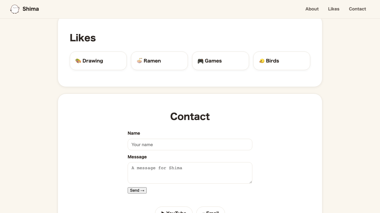
Shima’s page actually still has a few untouched spots left. No new tools needed—we just hand out the font-size, color, border-radius, and other things you’ve learned so far to the remaining parts.
We add class="h2" to the headings (About me, Favorites, Contact), .quote cite to the quotation’s source, a border and rounded corners to the input fields, and colors to the thank-you message after sending and to the footer.
.h2 {
  font-size: 30px;
  font-weight: bold;
  margin: 12px 0 0;
}
.quote cite {
  display: block;
  margin-top: 6px;
  font-size: 13px;
  color: #6b635c;
  font-style: normal;
}
.contact-form input,
.contact-form textarea {
  font-size: 15px;
  padding: 10px 12px;
  width: 100%;
  border: 1px solid #e9e3d9;
  border-radius: 12px;
  background-color: #ffffff;
  color: #2c2622;
}
.form-note {
  margin: 12px 0 0;
  color: #3f9a78;
  font-weight: bold;
  font-size: 14px;
}
.site-footer {
  text-align: center;
  padding: 8px 24px 40px;
}
.copyright {
  color: #6b635c;
  font-size: 13px;
  margin: 0;
}
None of these is a brand-new property—it’s just a matter of “which class goes on which part.” .form-note is where the thank-you appears when you press “Send” on the contact form—when we add motion in the JavaScript track, this green will come into play.
Summary of this lesson
positionis the one that takes things out of the normal flow to float and pin them- Start with
fixed(pinned to the screen) andsticky(sticks once you reach it) - Stacking order is
z-index(the larger the number, the closer to the front)