You want to line up menus or cards in a row — that's when Flexbox takes the lead. Just write display:flex on the parent, and the children go into a horizontal row. It's the heart of modern CSS.
Navigation menus, cards lined up in a row, an icon paired with text — “rows” you see all over the web. What lets you build these cleanly is Flexbox. It’s the star of modern CSS layout, and once you learn it here, you can suddenly build pages that look “the part.”
Put display:flex on the parent
First, wrap the things you want to line up in one parent (a <div>, etc.).
Then put display: flex; on that parent. To make it clear “this is the parent,” we’ve named the class parent too.
.parent { display: flex;}
That’s all it takes for A, B, and C — which usually stack vertically — to line up in a horizontal row. It’s a member of the display family, right? The idea that “display decides how things line up” starts paying off here.
Words alone are hard to picture, so let’s see it for real. With the same HTML, the arrangement changes completely depending on whether the parent has display: flex;.
The dashed “parent” frame is the same, yet only the bottom parent lines its children up in a horizontal row. The lining-up magic always goes on the parent’s side.
Tidy up the gaps and the alignment
Flexbox has handy partners for tidying up the arrangement.
justify-content … alignment along the horizontal axis (center for the middle / space-between to spread to both ends)
align-items … alignment along the vertical axis (center to align to the middle of the height)
Just learning these three lets you build most of the common arrangements, like “gather in the middle” or “spread out evenly.”
Change the value of justify-content a few ways, and the same three boxes spread out like this.
The parent’s width is the same for all three. Only the “horizontal alignment” of the boxes inside changes, exactly as the value specifies.
justify-content also has flex-start (left, the default), flex-end (right), and space-around and space-evenly (spreading the gaps out evenly). You don’t have to memorize them all — start with just the two, “center for the middle, space-between for both ends,” and recall the rest when you need them.
align-items, on the other hand, is in charge of the vertical axis. Line up boxes of different heights and its effect becomes clear. Change the value and the boxes’ top-to-bottom position changes like this.
Even with boxes of different heights, they snap to the top, middle, or bottom exactly as the align-items value says.
When they don’t fit, wrap them
Flexbox children shrink and cram together when they don’t fit the parent’s width. When cards get squished and it’s a problem, add flex-wrap: wrap; to the parent. The ones that don’t fit wrap onto the next line.
display: flex; on the parent of the parts you want to line up
gap for the spacing, justify-content for horizontal, align-items for vertical
A member of the display family — a tool for “deciding how things line up”
When they don’t fit, wrap them with flex-wrap: wrap;
Try it: put the header, photo, and social links in rows
Let’s spread the “name” and “nav” inside the header apart into a row, and put the two social links side by side too. Give the name’s logo part a new class="brand", and wrap the two social links in a new <div class="socials">.
.lp-header uses justify-content: space-between; to spread “name on the left, nav on the right” apart. .brand is a miniature Flexbox that lines up the small logo image and the name in a row. .nav puts its links in a row. .socials centers the two social links and lines them up side by side.
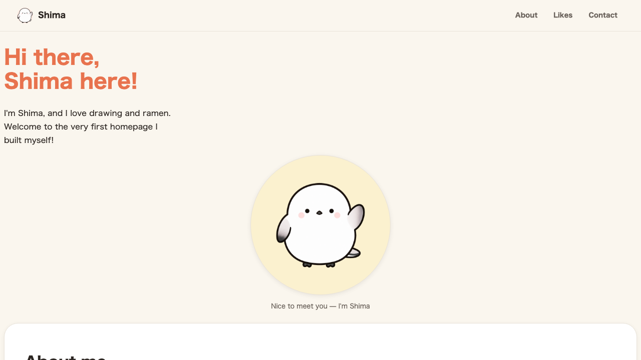
There’s one more place where Flexbox shines. Shima’s photo, in fact, still isn’t sitting on a round backing. Let’s wrap the photo in a round backing, <div class="hero__disc">, and tidy up the whole <figure> (given class="hero__art") with a Flexbox that “centers it vertically.”
<figure class="hero__art"> <div class="hero__disc"> <img src="/shima/hand.png" alt="Photo of Shima"> </div> <figcaption class="hero__caption">Nice to meet you, I'm Shima</figcaption></figure>
.hero__art uses flex-direction: column; to stack “backing → caption” vertically, and align-items: center; to center them. Since the photo itself just floats inside the big circle .hero__disc, we reset the photo’s own rounding and shadow for now with .hero__disc img. Rather than layering two circles, it’s a build that makes only the backing’s circle the star.
The parts, which had been stacked vertically all over the place, are each tidied into a horizontal row, and the photo now sits on a round backing.
FAQ
What if things don't line up even though I added display:flex?
You put flex not on the parts you want to line up, but on the parent that wraps them. Check that it's on the parent, and that the parts you want to line up are directly inside that parent.
How do I open up the gaps between parts?
Set gap on the parent (e.g. gap:16px). It's better than adding margin to each part, because you manage the gaps in a single place.
What if I want to stack them vertically?
Add flex-direction:column to the parent for a vertical stack. Ways of tidying up, like centering, use the very same tools as for a row.