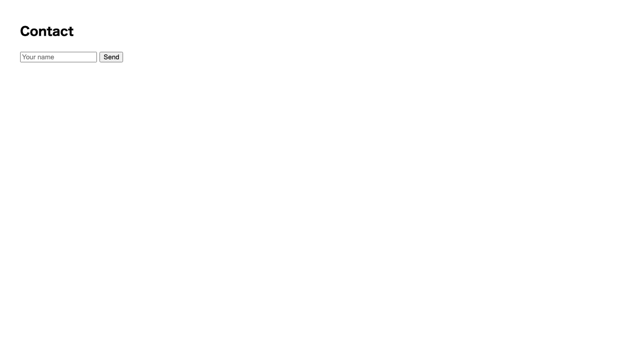
What we’ve built so far have been “pages for reading.” This time we change tack a little and place parts the user operates: buttons and input fields. Your page takes a step closer from something you “look at” to something you “use.”
A button you can press
<button> is a tag that makes a button, just as its name says. The text you wrap becomes the label on the button.
<button>Send</button>That alone shows a button you can click. “Something happens when you press it” — that “something” is what you can attach later, once you learn JavaScript. For now, just placing a pressable part is a big success.
Choosing between a button and a link
Links (<a>), which you learned earlier, were also “things you can press.” So how do you choose between them? The answer is what happens after you press.
| Part | What happens when pressed | Examples |
|---|---|---|
<a> | Moves to another place | A menu, a link to an article |
<button> | Does something on the spot | Submit, calculate, toggle a display |
Using CSS, you can make a link look button-like. Even so, the basic rule is to choose by role: “moving, use <a>; doing, use <button>.” When you use them by their role, they’re also handled correctly by keyboard operation and screen-reader software.
An input field for typing text
<input> makes an input field the user can type into. Like <img>, it’s a tag that doesn’t wrap any content.
<input type="text" placeholder="Enter your name">Broken down, it looks like this.
| What you write | Meaning |
|---|---|
<input> | The input-field part. A tag that’s complete on its own |
type="text" | What kind of input field it is (text means a field for typing text) |
placeholder="..." | The faintly shown hint text before you type |
Changing type changes the kind of input field. For example, type="password" makes the characters into dots, and type="checkbox" makes a checkbox. The fun part is that the same <input> changes its form depending on type.
Putting text in from the start (value)
Similar to placeholder but different in role is value. This one is the “real text” that’s in the input field from the start.
<input type="text" value="Shima">
<input type="text" placeholder="Enter your name">
Line them up side by side and the difference is clear.
| What you write | The text shown | When you start typing |
|---|---|---|
value | Normal dark text | Doesn’t disappear (you delete it and rewrite yourself) |
placeholder | Faint text | Vanishes at once |
value is used in situations like “pre-fill what was entered before” or “set a recommended value from the start.” Remember it as: hint means placeholder, contents means value.
value, so it has dark text in it from the start and stays unless you delete it yourself. The bottom field uses placeholder, so it vanishes at once when you start typing.Give it a try
Rather than just reading, it’s best to try the real thing. Try pressing the button and typing into the input fields.
value="Shima", so it has dark text from the start. The bottom uses placeholder, so it vanishes at once when you start typing. The button can be pressed, but it’s correct that nothing happens yet.Summary of this lesson
- A pressable button is
<button>label</button>. Moving, use<a>; doing, use<button> - A field for typing text is
<input type="text">(it doesn’t wrap any content) <input>changes its form when you changetype- A hint is
placeholder(disappears when you type), contents isvalue(doesn’t disappear)