CSS・More control over the look

Add a shadow to make it float

A card stuck flat to the page looks like it's floating in the air the moment you add a soft shadow. Use box-shadow to give your page some depth.

One more touch on that rounded card. Just add a little shadow and it looks like it lifts gently off the page. From a look printed flat on paper to a texture you could almost pick up — box-shadow is what makes that happen.

Let’s write one

.card {
  box-shadow: 0 2px 10px rgba(0, 0, 0, 0.06);
}

The four things lined up after box-shadow each mean this:

ValueRole
0The shadow’s horizontal offset (0 for straight down)
2pxThe shadow’s vertical offset (2 pixels down)
10pxThe width of the shadow’s blur (bigger means softer)
rgba(0, 0, 0, 0.06)The shadow’s color (a faint black)

“A faint black shadow, offset 2 pixels straight down, blurred by 10 pixels” — and the card looks like it lifts up gently.

Line up with-shadow and without-shadow and the difference in how it floats is easy to see.

Even the same white card, with just one faint shadow, looks like it floats a little, like paper.

Making a “color with transparency” using rgba()

A common choice for shadow color is rgba(). It’s a way of writing that adds one more thing — transparency — to the color names and codes you’ve used so far.

color: rgba(0, 0, 0, 0.06);

In the order rgba(red, green, blue, transparency), the first three are the number version of a color code, and the last, 0.06, is the transparency. 0 is fully transparent, 1 is fully opaque. A faint black at around 0.050.15 makes a shadow look soft rather than too harsh.

Layering shadows and denting them inward

box-shadow, separated by commas, can apply several shadows at once.

.card {
  box-shadow:
    0 1px 2px rgba(0, 0, 0, 0.08),
    0 8px 24px rgba(0, 0, 0, 0.06);
}

A small, crisp one up close and a wide, soft one further out — layering two gives more natural depth than just one.

Rather than just one, layering two makes the edges softer and floats more naturally.

Put inset at the start of the value and the shadow forms on the inside.

.input {
  box-shadow: inset 0 2px 4px rgba(0, 0, 0, 0.1);
}

Opposite to a shadow that floats up, it gives a slightly dented look. It’s a way of writing often used to represent input fields and sunken buttons.

Even the same box, with inset added, looks dented inward rather than floating out.

Summary of this lesson

  1. A shadow is box-shadow. Four things: horizontal offset, vertical offset, blur, and color
  2. Use rgba() for the color to make a color with transparency
  3. Keep shadows faint — low rgba transparency looks elegant
  4. Layer several shadows with commas. inset makes an inner shadow too

Try it: add shadows to the cards and the round photo

Add shadows to the .card boxes you’ve been rounding (the three boxes: self-introduction, favorites, and contact) and the round photo. Add a new class="like" to each individual favorites card.

<li class="like">🎨 Drawing</li>
.card {
  background-color: #ffffff;
  border: 1px solid #e9e3d9;
  border-radius: 28px;
  box-shadow: 0 2px 10px rgba(0, 0, 0, 0.06);
  padding: 40px;
}

figure img {
  border-radius: 50%;
  box-shadow: 0 2px 10px rgba(0, 0, 0, 0.08);
}

.like {
  background-color: #ffffff;
  border: 1px solid #e9e3d9;
  border-radius: 20px;
  box-shadow: 0 2px 8px rgba(0, 0, 0, 0.05);
  padding: 18px;
  font-weight: bold;
  font-size: 15px;
}

Background color, border, rounded corners, and spacing stay the same. We added one line of box-shadow to .card, .like, and the round photo. .like is .card’s little brother — the same idea of shadow, applied to a slightly smaller card.

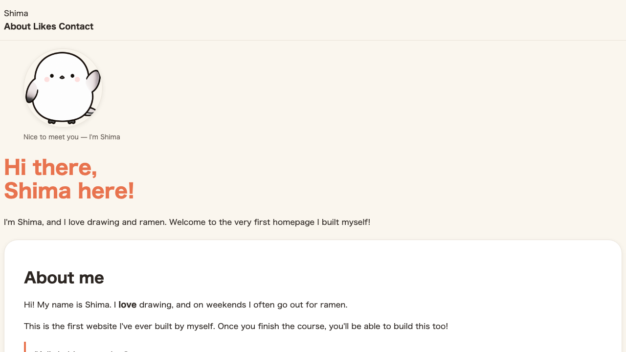
Browser view. The white cards like the self-introduction and the round photo have a faint shadow that makes them look like they float gently
Just adding a shadow makes a card that was stuck flat look like it floats a little, like paper. The .like favorites cards get the same shadow too, so the lower part of the screen comes together in the same tone.

FAQ

How do I add two or more shadows?
List them separated by commas and you can apply several shadows at once. Layering two — a small, crisp one up close and a wide, soft one further out — gives more natural depth.
Can I put a shadow on the inside?
Yes. Add inset at the start of the value, like box-shadow: inset 0 2px 6px rgba(0, 0, 0, 0.1);, for a shadow that dents inward. It's often used to represent input fields and sunken buttons.
How do I change the direction of the shadow?
Make the first number (horizontal offset) and the second number (vertical offset) negative, and the direction of the shadow changes. To shift it up or to the left, use negative numbers.